A page has a shape before it has a look: what its first screen does, what kind of header it has, whether it is one column, sections, cards or a sidebar, and where the reading ends. Most builds that go wrong do so here, before any colour is chosen: an app's left rail on a story, a landing page's hero on a dashboard, a grid of cards for a page that should be read from top to bottom.
Concept first. Write the concept (what the page is, who it is for, how it should feel), then pick the shape here that is nearest to it, or compose one with the method at the end, and name it in the build notes: "Shape: Event, with the programme as a timeline". A shape is a starting point, never a template to fill and never a ceiling. Change whatever the concept asks for and write down why. Where the person asked for something a shape advises against, the person wins.
Placement and layout is the detailed rulebook for the first shape, the app workspace. Its viewport rules (about 600 pixels of height on a 1280×720 laptop, 100dvh, safe areas, the phone's keyboard), its target sizes and "nothing widens the page" hold for every shape here, as do Layouts that never break, Motion and feel and the Accessibility baseline.
These shapes were written on 16 November 2026 from the owner's question (how should a service, a dashboard, a product reveal, a personal homepage, an event or a story about a treehouse each be laid out?) and from the kits the library has. None has been through a showcase run yet; the first two planned are a personal homepage and a story, and what they teach will be added under each shape, as in the other playbooks.
| Shape | In a line |
|---|---|
| App workspace | The work in the middle, the chrome at the edges. |
| Dashboard | Summary to detail: the one number, a row of figures, charts, the table. |
| Product reveal | One object in full-bleed scenes as you scroll, the copy beside it, the call at the end. |
| Service landing | What it does and for whom in one screen, proof, how it works, pricing, one call repeated. |
| Story or long read | One column of reading width, chapters, pictures that break out, few scroll scenes. |
| Personal homepage | Who, what they make, the work, how to reach them: short, personal, quick to scan. |
| Event | What, when and where at once; the programme; how to come; and a page that changes with the day. |
| Shop | Find, compare, decide, buy: listing, product, basket. |
| Game | The play fills the screen; menus and HUD stay out of its way. |
Before you start
- (default) The concept is written before a shape is picked: what the page is, for whom, and how it should feel.
- (default) The build notes name the shape: one of these, changed where the concept asks, or one composed with the five steps at the end.
- (default) The reader's one job and the action at the end of the reading path are each written in a sentence.
- (default) The first screen is planned at 1280×720 (about 600 pixels of height under the browser's bars) and at 390×844.
- (default) Where the person asked for something the shape advises against, their wish is built and the notes say which rule it bent.
- (always) Nothing widens the page at 320 pixels wide and every target is at least 24 pixels: WCAG AA's reflow and target size, without which people who zoom or use a small phone can't use the page at all.
- (always) Nothing moves on its own for more than five seconds without a way to pause it, and reduced motion is honoured: WCAG AA's pause rule, and motion can make people ill.
App workspace
For tools people work in for hours: an editor, a board, an inbox, an admin screen. The reader's one job: get their work done without hunting for the controls.
- Reading path: the work in the middle, the tools at its edges. The primary action sits at the top right of the work it acts on.
- First screen: the work itself, at once: no hero, no welcome banner. At 1280×720 tall toolbars close up to fit about 600 pixels; on a phone the work fills the screen.
- Navigation and header: a left rail of places, a slim top bar (about 48 px) with search, account and settings at its right, and
Ctrl Kfor everything. - Structure: rail, work, and a details panel on the right that opens beside the selection.
- Density and rhythm: compact. Rows of 32 to 40 px; panels divided by a 1 px line rather than by space.
- On a phone: the rail becomes a bottom tab bar of five at most, the details panel a bottom sheet, and toolbars fold behind More.
- Motion: feedback only: a press, a panel arriving, the view gliding to something new. Nothing ambient.
- Fits: the Foundations kit as it is: command palette, split panes, menus, beside placement, data table, labelled undo. Looks
boardroom,atrium,glass,ink,brutalist. Tones strict and refined.
The detailed rules for this shape are Placement and layout: one home per job, beside and never over, the viewport.
What not to do
- (default) No hero, no marketing header. A landing page's big first screen pushes the work under the fold of a 600-pixel laptop, and people open a tool to work in it.
- (default) Only the work scrolls. The bars stay put, so the tools are always where the hand left them.
How you know it works
- (default) A returning user does the commonest task from a cold load in two clicks or one
Ctrl Kcommand. - (default) At 1280×720 every tool is on screen without scrolling the page, and the work keeps at least half the width.
Dashboard
For watching numbers and acting when one moves: sales, operations, a service's health, a team's week. The reader's one job: know within five seconds whether all is well, and then find out why not.
- Reading path: the one number that matters top left, a row of three to five figures, the charts, then the table. It ends at the row that needs action: open it, assign it, mark it.
- First screen: at 1280×720 the headline number, the row of figures and the top of the first chart, all inside 600 pixels, with the date range and filters in a bar above. On a phone the headline and the figures two by two.
- Navigation and header: a slim bar (48 to 56 px) whose title says what the board covers and when it was updated, with the date range and filters. A left rail only when there are several boards.
- Structure: a 12-column grid. Figures in a row of equal tiles; charts two a row at 1280 (each at least 480 px wide); the table full width.
- Density and rhythm: compact to comfortable, 16 to 24 px gaps. Sections are told apart by their headings and the grid's gaps, never by cards inside cards.
- On a phone: one column. The figure row goes two by two, charts go full width, tables become stacked blocks (placement's 40rem rule), and filters go into a sheet behind a button that says what is set.
- Motion: a value that changes animates once (a needle chasing, a number rolling); nothing ambient. Live data says live, paused or ended.
- Fits: the Dashboard kit: KPI tiles for the row of figures, quiet charts, chart access, gauges and rings, data table, date picker, day timeline, loading states. Looks
boardroom,atrium,holo,orrery,glass,undertow. Tones strict and refined. Placement's "Data displays" holds here in full.
What not to do
- (default) No hero and no welcome copy. The first 600 pixels belong to the numbers.
- (default) No wall of equal cards. A card per figure, each with its own chart, legend and menu, has no summary: give the one number the top left and let the rest be smaller.
- (always) Every chart also as a table or words. A screen reader gets nothing from the picture, so the facts must be there in text (chart access).
How you know it works
- (default) Someone who has never seen the board says from its first screen, at 1280×720, whether things are fine, within five seconds.
- (default) Each figure in the top row leads to the chart or rows behind it in one click.
Product reveal
For one object shown as a thing worth wanting: a new device, a bicycle, a chair, a watch. The reader's one job: understand what it is and why it is special, and want it.
- Reading path: the object arrives; scene by scene its features as you scroll, one claim a scene; the specifications; the call (pre-order, find a stockist, configure). It ends at the call.
- First screen: the object, large and well lit, with its name and one line. At 1280×720 it takes about 60% of the width with the copy beside it; on a phone it sits above, the name below. A poster still shows at once, and the 3D arrives without moving the layout.
- Navigation and header: a slim bar (about 48 px) with the name and the call at its right, appearing once the first scene has scrolled past. Three or four anchors at most; no rail.
- Structure: full-bleed scenes, each one screen tall (
100dvh, at least 600 px), the object held in place while the copy changes beside it; then a specifications table and the call. - Density and rhythm: airy. One claim a screen in one or two sentences, six to eight scenes in all.
- On a phone: the copy goes under the object, and the camera director's lens shift reframes it rather than squeezing it. The 3D steps down to a light tier or a still (capability tiers).
- Motion: the scroll moves the camera between shots and the copy reveals; one signature moment (the arrival). Under reduced motion the shots cut instead of flying.
- Fits: the Product presentation kit: glTF motion, camera director, labels on its parts, a stage locked to CSS, read reveals, an arrival. Looks
specimen,orrery,grid,splash,ink. Tones refined and playful.
What not to do
- (always) The scroll stays the reader's. Scenes follow the scroll position and never take over the wheel or carry the page further than the reader scrolled: that takes control from keyboard and switch users and moves the page under people whom motion makes ill.
- (always) The words are text in the page. The name, the claims and the price are HTML beside the canvas, never drawn into it, because a screen reader and a search engine read only text.
- (default) No datasheet on the first screen. A grid of specification cards up front turns a reveal into a catalogue page; the specifications come last.
How you know it works
- (default) With WebGL missing or the model slow to load, the poster still and the copy tell the whole story, and the call is reached.
- (default) Scrolled at an ordinary pace, each scene holds long enough to read its line, and the 3D keeps its frame budget on the target laptop (Performance budgets).
Service landing
For a service someone might sign up for: a booking tool, an invoicing app, a reading app. The reader's one job: decide whether it is for them, and try it.
- Reading path: what it does and for whom; proof (a product picture, three short quotes or figures); how it works in three steps; features by the job they do; pricing; questions; the call again. The call repeats in the header, the first screen, after pricing and at the foot.
- First screen: at 1280×720 a headline of at most ten words saying what it does for whom, one sentence under it, the primary call ("Start free") and a quieter second ("See how it works"), and a real picture of the product; the top of the next section peeks in. On a phone: headline, sentence, call, then the picture.
- Navigation and header: a slim sticky bar (56 to 64 px): the name at the left, three to five links (Features, Pricing, Help), Sign in and the call at the right. On a phone, a menu button and the call stay.
- Structure: sections of text beside a picture, alternating sides; a feature grid of three a row at 1280; two to four pricing cards side by side with the recommended one marked, and a comparison table under them; the questions as folds.
- Density and rhythm: comfortable. 96 to 128 px between sections at desktop (48 to 64 on a phone), with alternate sections on a band of the surface colour; prose no wider than 70 characters.
- On a phone: one column. Pricing cards stack with the recommended one first, the comparison table becomes one block per plan, and the sticky bar keeps only the call and the menu.
- Motion: light. Sections reveal once as they arrive, a monthly/yearly switch slides; one product animation at most.
- Fits: the Foundations kit: micro-interactions for the calls, segmented controls for monthly or yearly, folds with no script for the questions, steady fields for the sign-up form, dialogs. Looks
atrium,glass,ink,boardroom. Tones refined and playful.
What not to do
- (default) No app chrome before sign-up. A rail and a toolbar around the page make visitors think they are already in the app; show the app in a picture instead.
- (default) No splash or intro. Visitors decide in seconds, so the headline is readable the moment the page arrives.
- (default) Prices on the page. "Contact us" alone hides what visitors came to compare; use it only when the person asks for it.
How you know it works
- (default) Shown the first screen for five seconds, a stranger can say what the service does, for whom, and what the button will do.
- (default) From any scroll position the call is at most one screen away.
Story or long read
For something read from start to end: a case study, a history, an essay, how something was made. The reader's one job: read it through and come away with it.
- Reading path: a title and a standfirst, then the chapters in order, with pictures breaking out of the column. It ends with what to do next: read on, write back, visit.
- First screen: the title, a standfirst of one or two sentences, the author and date, and the first lines of text above 600 px at 1280×720; or a cover picture at most one screen tall with the text's start in sight. On a phone: title, standfirst and the opening lines.
- Navigation and header: a minimal bar that hides as you read down and comes back as you scroll up, a thin progress line, and the chapters as a contents list: in the margin beyond 1200 px, a menu on a phone.
- Structure: one column of 60 to 75 characters (
max-width: 68ch). Pictures at three widths: in the column, breaking out to about one and a half columns, and full-bleed for the few that open a chapter. Notes in the margin on wide screens. - Density and rhythm: airy. Body text 18 to 21 px at a line height of 1.5 to 1.6; chapters part with a large chapter title and space, or with a full-bleed picture.
- On a phone: margin notes go in after their paragraph, breakout pictures go full width, the contents go into a menu, and the body stays at 17 to 18 px.
- Motion: sparing. One or two scroll scenes in the whole story, only where the content is a change (a route drawn on a map, before and after); otherwise pictures fade in once.
- Fits: the Foundations kit, with read reveals for findings handed out as you reach them, a day replayed by scrolling, and the site plan for a place drawn from data. Looks
ink,boardroom,orrery. Tones refined and playful.
What not to do
- (default) No cards, no grid, no rail. A story is one path; a grid of chapter cards asks the reader to choose an order the writer already chose.
- (always) Every word is in the page from the start. A reveal or a scene changes how text looks, never whether it is there, because a screen reader, a reader with reduced motion or one whose scripts failed must get every word.
- (default) Lines stay short on wide screens. At 2560 px the extra width goes to margins and breakout pictures, never to longer lines.
How you know it works
- (default) Read on a phone from top to bottom, nothing makes the reader stop to work out the page: no sideways scroll, no scene to wait for.
- (default) The reader can always see how far they are and jump to any chapter.
Personal homepage
For one person: who they are, what they make, the work, how to reach them. The reader's one job: decide in half a minute whether this is someone to work with or follow, and how to reach them.
- Reading path: the name and a line about what they do; a few chosen works; a short about; contact. It ends at contact: an email link, a short form or a few profiles.
- First screen: the name, a line saying what they do, and a picture or a piece of work that shows their hand, with contact one press away in the bar. At 1280×720 the start of the work shows; on a phone, the name, the line and the first piece.
- Navigation and header: none, or a slim bar with three or four links (Work, About, Contact). One page with anchors is often enough. No rail.
- Structure: a grid of work, two or three a row at 1280, each with a title and a line, each opening a short case page shaped like a story; the about in one column.
- Density and rhythm: comfortable to airy, and short: the whole page in four to six screens.
- On a phone: the grid becomes one column, pictures keep their ratio, and contact is a large link at the end as well as in the bar.
- Motion: room for one personal touch (a handwritten name, cards that answer the hand); otherwise quiet.
- Fits: the Foundations kit, with cards on springs for a playful grid of work, stroke-font text for a name that writes itself, micro-interactions. Looks
ink,splash,comic,fling,atrium. Tones playful and refined.
What not to do
- (default) Show the work, not a dashboard of skills. Skill bars and percentage rings say nothing a reader can trust.
- (default) No intro before the name. The visitor came for the person; the name and what they do are readable at once.
- (default) No service-landing sections (pricing, three steps, quotes) unless the person sells a service from the page.
How you know it works
- (default) In ten seconds a stranger can say who this is, what they make, and how to reach them.
- (default) The person it is about reads it and says it sounds like them.
Event
For a date people should come to: a meetup, a conference, a festival, an opening, a wedding. The reader's one job: decide to come, and come at the right time to the right place. The page changes with the day: before, during and after.
- Reading path: what, when and where; why come (the speakers, the acts, what happens); the programme; how to get there; the call (register, tickets, reply). Before the day it ends at the call.
- First screen: the name, the date with its weekday and the time with its time zone, the place (venue and town) and the call, all as text, inside 600 px at 1280×720 and on the first phone screen. A picture or a mood behind them, never instead of them.
- Navigation and header: a slim sticky bar (about 56 px) with the name and date, three to five anchors (Programme, Speakers, Venue, Questions) and the call at the right.
- Structure: sections. The programme as a list by time for one track, as a day timeline of rooms or stages for several; speakers three or four a row; the venue with a plan and how to travel; questions as folds.
- Density and rhythm: comfortable, the programme denser: a time column and a line a session.
- On a phone: the programme becomes a list by time with the room as a label, filterable by track, each session with "add to calendar"; the call stays in the bar.
- Motion: quiet before; during, the now line moves a minute at a time; after, one closing moment at most (a names wall). Audience votes run during.
- Fits: the Foundations kit, with day timeline, site plan, steady fields for registering, banners. Looks
atrium,atmos,splash,comic,grid. Tones refined and playful.
Before, during and after
- Before: the call ends the page and sits in the header. A countdown at most as a line ("in 12 days"), never a ticking clock; the programme may say what is still to come.
- During: the page becomes the day's companion. The first screen shows what is on now and next (the timeline's now line), room changes and the map, and the call becomes "Find your room" or "Watch live". The phone is the main device, so it works with poor signal (phone app shell).
- After: thanks, recordings, pictures and the date of the next one. The registration call goes.
What not to do
- (default) No date without its weekday, year and time zone, and times also in the reader's own zone when the event is online.
- (default) No splash before the facts. A full-screen video intro hides the three things people came for.
- (default) The page never stays in "before". A page still selling places a month after the day looks abandoned; switch it by the date, not by hand.
How you know it works
- (default) From the first screen, at 1280×720 and on a phone, someone can say what, when (weekday, date, time) and where, and press the call.
- (default) With the clock set to the day itself and then a week after, the page shows now and next, then the after page, with no stale call.
Shop
For buying things: a bakery's orders, a maker's shop, a catalogue. The reader's one job: find the thing, be sure it is right, and buy it without friction.
- Reading path: the listing (find, filter, compare), the product (look, choose a variant, add), the basket, the checkout. It ends at "Place order".
- First screen: on the listing, what the shop sells and the first row of products, with search and the basket in the header. On a product page at 1280×720, the pictures, the name, the price, the choice of variant and "Add to basket" side by side above the fold; on a phone the picture, name and price, with the add button in a bar at the bottom.
- Navigation and header: a sticky bar (56 to 64 px): the name, the categories or a menu, search, account, and the basket with its count. No rail, except filters on a listing.
- Structure: a listing has a filter column (240 to 280 px) and three or four products a row; a product page two columns (pictures 55 to 60%, details beside); the basket its lines and a summary column; the checkout one column in few steps.
- Density and rhythm: comfortable. Product cards one size, pictures one ratio, prices in tabular figures.
- On a phone: two products a row; filters in a sheet behind a button that says how many are set ("Filter · 3"); the add button stays in reach at the bottom; the keyboard never covers the pay button.
- Motion: feedback: the item landing in the basket's count, a card lifting under the pointer. Nothing ambient on a product page or in the checkout.
- Fits: the Shop kit: cards on springs, micro-interactions, swipe actions, phone app shell, steady fields, hold to confirm, list smarts. Looks
atrium,glass,fling,ink. Tones refined, playful and strict.
What not to do
- (default) No reveal scenes on product pages. Someone comparing ten products can't wait for each to stage itself; keep the cinematic page for one hero product.
- (default) No surprise at the end. Delivery and tax show before the checkout, and the total says what it includes.
- (always) The checkout works for everyone. Every field has a label, every error is said in words beside its field and nothing times out unannounced, because a form a screen reader can't finish shuts its user out of buying.
How you know it works
- (default) On a phone, with one thumb, a product is found, a variant chosen and the order placed, and the keyboard never covers the button.
- (default) The basket's count and total change the moment something is added.
Game
For play: a puzzle, a racing game, a party game in the browser. The reader's one job: play.
- Reading path: the title screen, one obvious "Play", play; after a round, "Again". Menus are a short stack, never a site.
- First screen: the game's own world with "Play" one press away. The first level loads before the menus' extras.
- Navigation and header: none during play. Escape, Start or a corner button pauses the world and opens the menu over it, dimmed; menus are a list worked by keys, gamepad or touch.
- Structure: a full-screen canvas (
100dvh, no page scroll), the HUD in the corners with the centre clear, menus as panels over the paused world. - Density and rhythm: a HUD of three to five readouts; menu targets large.
- On a phone: touch controls in the thumbs' reach at the bottom corners, the HUD at the top, clear of the notch and home bar; the game pauses when the tab is hidden.
- Motion: as much as play needs. Menus change quickly (panel choreography), and effects never cover the numbers being read.
- Fits: the Game kit: play input, game cameras, capability tiers, dynamic resolution, UI sounds, effects switchboard, menus. Looks
comic,fling,grid,splash. Tones playful, refined and strict.
What not to do
- (default) No page around the game. No site header, footer or scrolling page round the canvas while playing.
- (default) Nothing in the centre but play. Warnings and countdowns go to the edges, as in Placement.
- (always) Nothing flashes more than three times a second. Faster flashing can bring on seizures (WCAG 2.3.1), and no effect is worth that.
How you know it works
- (default) From a cold load, play starts within two presses.
- (default) Mid-play, Escape, Start or the corner button pauses the world at once, and every menu works by keyboard, gamepad and touch.
Compose a shape
When no shape fits, or two fit halfway, compose one. Improvising is fine; improvising without a method is how an app's rail ends up on a wedding page.
- Say the reader's one job and the one action at the end of the path. In a sentence each.
- Name the shape of the content: a list, a timeline, a map, a story, a single object, a set of work, a form, live numbers. The content's shape decides the page's shape, never an app's defaults.
- Decide what the first screen must do at 1280×720 (about 600 px of height) and on a phone.
- Pick the nearest shape and change what the content asks for, or build from the content up.
- Write the result as a shape entry in the build's notes, with the same fields as the shapes above, so the next run can learn from it.
The content's shape points to where to start:
| The content is | Start from | Parts that fit |
|---|---|---|
| Live numbers | Dashboard | quiet charts, gauges |
| A single object | Product reveal | camera director |
| A story, or anything read in order | Story or long read | read reveals |
| A timeline of dated steps | Story, or Event for one day | day timeline |
| A set of work | Personal homepage | cards on springs |
| A place | Story or Event, with a plan | site plan |
| A list to choose from | Shop | data table, list smarts |
| A form | One column, as in Placement | steady fields |
- (default) Borrow by field, not by page. Take a shape's ending, its header or its phone layout, and say in the notes which shape each came from.
- (default) Keep what holds for every shape. The checklist at the top applies to a composed shape too.
- (idea) A composed shape that works twice is a candidate for this playbook. Say so in the notes, and the owner can add it.
Worked example: a family treehouse
A family built a treehouse over a summer and wants a page about it: the story of making it, with a timeline and pictures, ending in "come and visit". No shape here is that.
1. The job and the action. The reader follows the build from the first plank and wants to see it. The action: "Come and visit", choosing one of the open weekends and sending a short note.
2. The content's shape. A timeline of fourteen dated weekends, each with two to four pictures and a few lines; one finished object (the treehouse); the people who helped; a place (the garden). Timeline and story lead, so the page is a story with a timeline as its spine. The place is the family's home, so the address stays off the page and goes in the reply to a visit note.
3. The first screen. At 1280×720: the finished treehouse in a picture across the width but at most about 520 px tall, so the first weekend's date and opening lines show under it; over it the title "We built a treehouse" and one line, "Fourteen weekends, one old oak, and everyone helped"; a slim bar with "Come and visit" at its right. On a phone: the picture cropped to the house (object-position), the title on a band beneath, the first date at the bottom edge.
4. The nearest shape, changed. Story or long read, with these changes:
- the chapters are weekends: a spine of dates down the left of the column at 1280, the column kept at 68ch; on a phone each date becomes a label over its chapter, and the progress line reads "weekend 6 of 14";
- pictures in before-and-after pairs side by side at 1280, stacked on a phone, and one full-bleed picture for each phase (platform, walls, roof);
- from the Personal homepage, a short "who helped" strip: a name and a picture each;
- from the Event, the ending: the open weekends as a list of dates, and a short form (name, which weekend, how many);
- motion: pictures fade in once; one signature moment at most, the oak in the same frame each weekend on a slider you can drag or step with the keys;
- dropped: app chrome, cards for chapters, a countdown.
5. The shape entry, in the build's notes:
## Build story (composed from Story or long read, with Event's ending)

For: a thing made over time, told along its dates. Job: follow the making and want to see it.
Reading path: the finished thing, then the dated steps in order, who helped, the invitation. Ends at "Come and visit".
First screen: the finished thing at most ~520 px tall at 1280×720 with the first date and lines under it; on a phone, the picture cropped, the title below, the first date at the edge.
Navigation: a slim bar with the call; progress as "weekend 6 of 14"; no rail.
Structure: one 68ch column on a spine of dates; before-and-after pairs; one full-bleed picture a phase; a "who helped" strip; open dates and a short form.
Density: airy; a step a screen or less.
On a phone: dates as labels over their chapters; pairs stack; the form in one column.
Motion: fade-ins once; one slider through the weekends.
Fits: Foundations, steady fields for the form. Looks ink, splash. Tones playful, refined.
Don't: put the address on the page; give the chapters cards; add a countdown.
Works when: a stranger reads it on a phone to the end and asks to visit; the family says it is their summer.
Data: { id: 'build-story', kits: ['foundations'], tones: ['playful', 'refined'], looks: ['ink', 'splash'],
  words: ['we built', 'making of', 'build diary', 'treehouse', 'renovation', 'come and visit'] }
Parts that show it
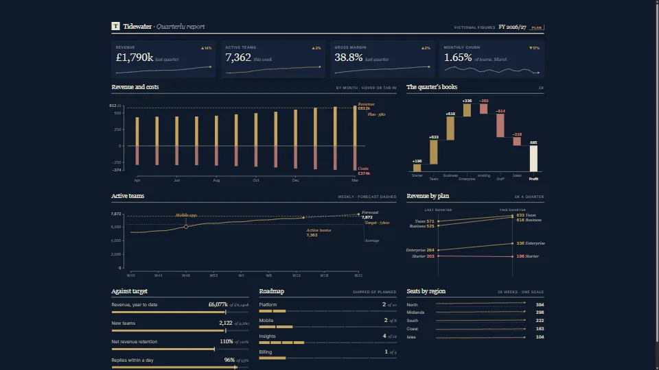 Data & layout
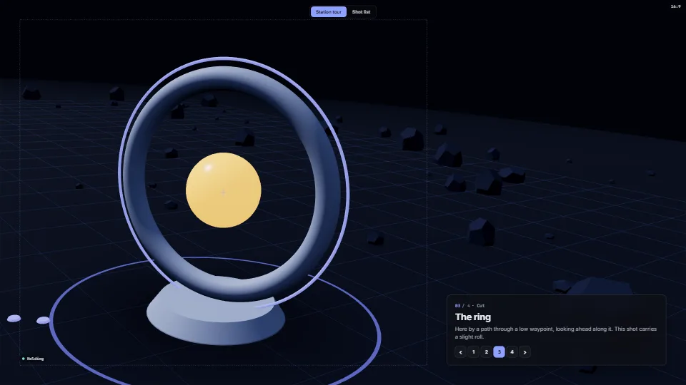 Techniques
Camera director
Cinematic camera moves between stations in a 3D world, with shots as data.
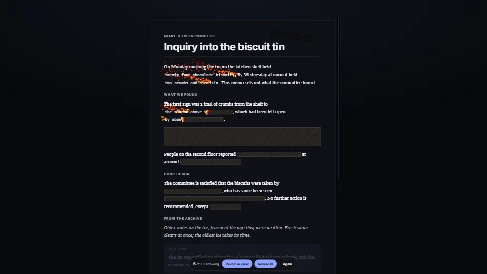 UI & interaction
Passages that reveal as you read
A passage hidden under a material until the reader reaches it.
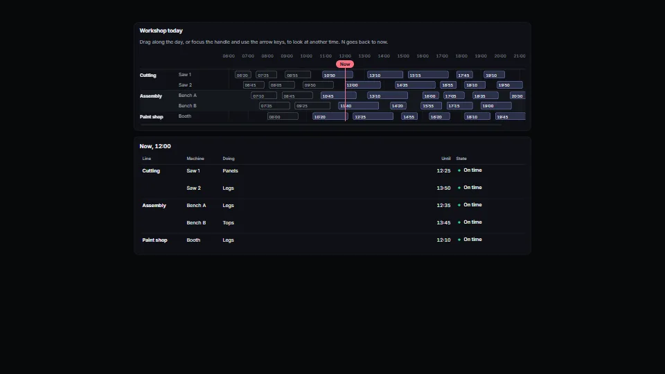 UI & interaction
Day timeline and scrubber
A day or a shift as rows of spans under an hour axis, a line for now, and a handle you drag along the day (or move with the keys) to look at another moment.
 Data & layout
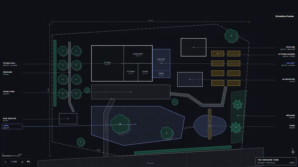
Architect’s site plan in SVG
A site plan drawn from plain data in the conventions of an architect’s drawing.
 UI & interaction
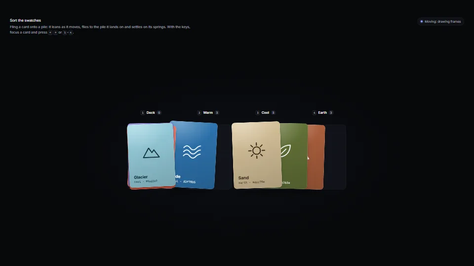
Cards on springs
Cards that feel like things: each sits on damped springs for its place, turn, squash, paper flutter and lift.
 UI & interaction
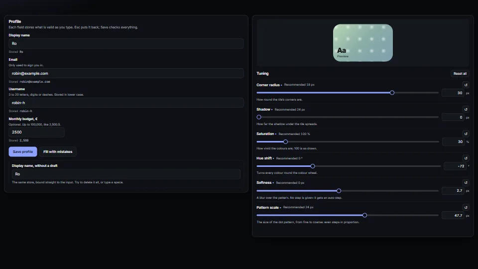
Fields that don’t fight you
Form fields that behave: a draft kept apart from the store (typing never fights a re-render, Esc puts it back, an emptied name comes back), messages tied to…
 UI & interaction