 UI & interaction
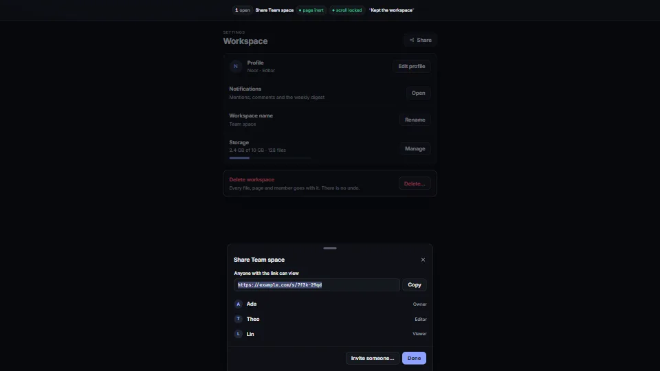
Accessible dialogs: modal, sheet, confirm
One small dialog core that does the whole job: a modal, side and bottom sheets you can drag away, and awaitable confirm() and prompt().
<0.01 CPU ms
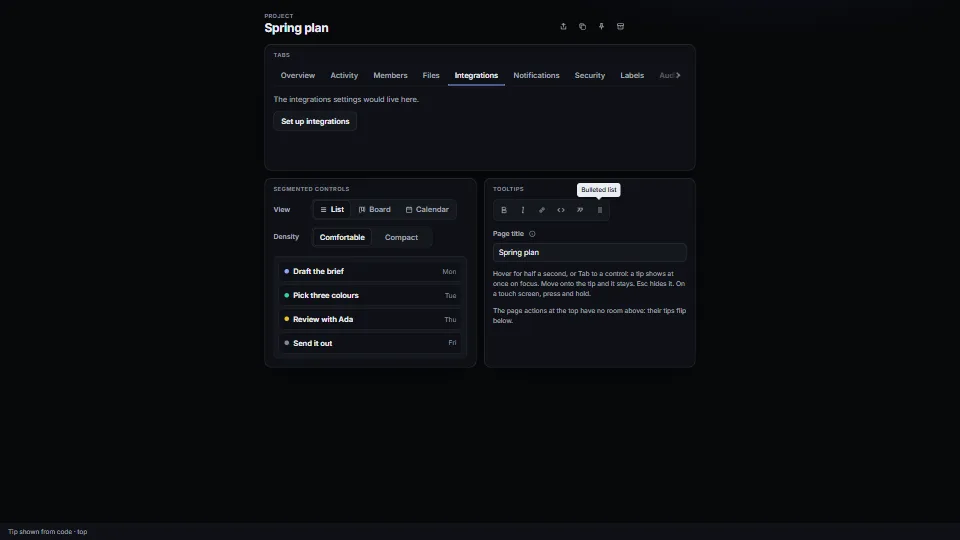
Three small cores that get the details right.
Measured 7 November 2026 on 13th Gen Intel(R) Core(TM) i9-13900H, Chrome 156, 1920×1080 at 1×. 600 frames × 3 rounds, median kept. What ran: Measured with the demo driving itself, one step every 20 frames: the next tab is chosen (its panel shown, the marker slid), the view and range segments move on, and a toolbar tooltip is shown and placed, then hidden. Nothing runs between steps: every core rests until something happens. Phones: tiers are being measured next.
| Machine | GPU ms | CPU ms | CPU p95 |
|---|---|---|---|
| unknown GPU · 13th Gen Intel(R) Core(TM) i9-13900Hreference · measuring tool | not timed | <0.01 | 0.23 |
| apple · Apple A19 Proin a browser tab · 16 November 2026 | not timed | <0.01 | 0.02 |
| Intel Arc 140V (Xe2-LPG) · Intel Core Ultra 7 258Vin a browser tab · 15 November 2026 | not timed | <0.01 | 0.32 |
Bars against one 16.7 ms frame. A browser-tab run is timed in a visible tab without the tool’s scripted input, so read it as close, not exact.
From HaTac. Fully custom code.
WAI-ARIA Authoring Practices Guide (W3C): The tabs pattern (roles, aria-controls and aria-labelledby both ways, automatic and manual activation, Home/End), the radio group pattern (one Tab stop, arrows move and check) and the tooltip pattern (role=tooltip, aria-describedby, Esc). Written here from scratch.
WCAG 2.2, 1.4.13 Content on Hover or Focus (W3C): Why a tip can be dismissed with Esc, can be hovered itself, and stays until the pointer or focus leaves.
UI & interactionOne small dialog core that does the whole job: a modal, side and bottom sheets you can drag away, and awaitable confirm() and prompt().
 UI & interaction
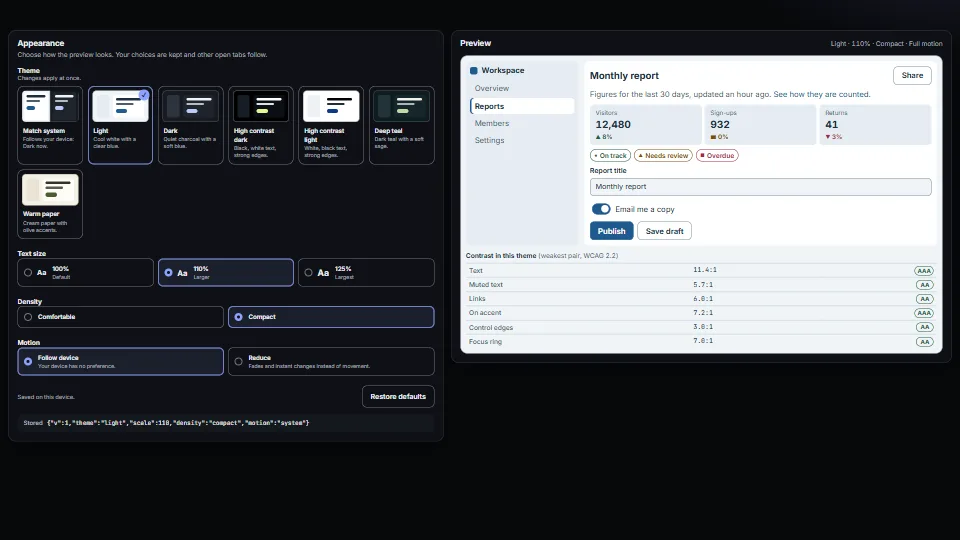
A small appearance system: colour presets as CSS variables (light, dark, two high-contrast, two accent looks), a “Match system” choice that follows the…
 UI & interaction
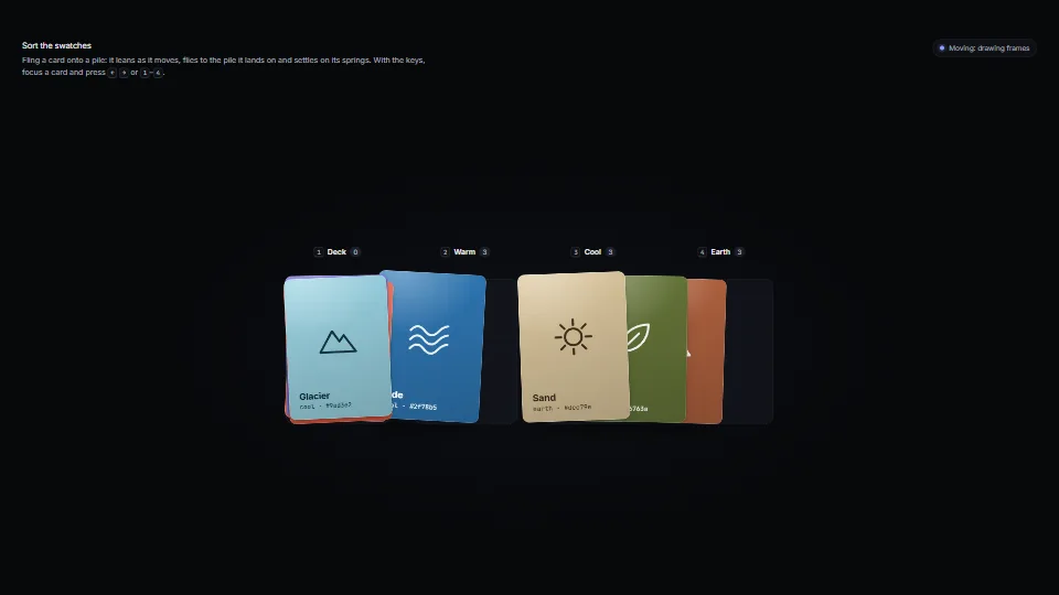
Cards that feel like things: each sits on damped springs for its place, turn, squash, paper flutter and lift.
 UI & interaction