Accessibility isn't a feature you add at the end. It is whether the thing works for someone using only a keyboard, a screen reader or 200% zoom, for someone who can't tell red from green, and for someone who gets sick from motion. Most of it is cheap when it is part of the work from the start, and some of it can be tested like any other code.
This baseline is what every screen should meet before it ships. It comes from a board app that tests its status colours against colour blindness and says every important moment in words, from a game's menus built to work by keyboard alone, from Spacious, the owner's own app, which draws its board on a canvas, and from this library, whose own site failed one of these checks while this playbook was being written.
Rules marked always are that baseline and hold, because they are what lets someone use the screen at all; defaults are where to start, and you may break one when you can say why; ideas are suggestions.
Before you start
- (always) Everything works with the keyboard alone, in reading order, with a focus ring you can see: one ring per control, never a doubled frame. It is the only way in for someone who can't use a mouse.
- (always) Text has 4.5:1 contrast against its background; large text, control edges and icons have 3:1. Below that, someone with low vision can't read it.
- (always) Nothing is said by colour alone: every status also has a shape or a word, on a canvas too, where it is drawn and also said in a live region. One man in twelve can't tell red from green.
- (always) Every control has a name a screen reader can say, and its state (pressed, open, current) is exposed, because a screen reader has nothing else to go on.
- (always) Changes that matter are announced once, since a screen-reader user can't see them arrive; constant chatter isn't announced at all.
- (always) Every chart and drawing has its facts as a table or as text too, or a screen reader gets none of them.
- (always) The page works at 200% zoom and 320 pixels wide, and every target is at least 24 pixels, so people who zoom or whose hands shake can still use it.
- (default) Where the pointer is a finger, targets are 44 pixels.
- (always) Motion follows the reduced-motion setting, as Motion and feel describes. Motion on screen makes some people sick.
Keyboard first
- (always) Tab follows the reading order. If it jumps around, the layout and the DOM disagree: fix the order in the DOM, not with
tabindexnumbers. A keyboard user thrown about the screen loses their place. - (always) Focus is always visible. A ring of 2 pixels in the accent colour, shown with
:focus-visibleso it appears for the keyboard and not for every mouse click. A keyboard user has no other way to see where they are. - (always) One ring per control. The ring hugs the control or replaces its border: never a second frame set off from the first, and never a ring on a field and another on the box around it. Where a frame holds a field (a search box with an icon), the frame shows the focus and the field draws none. In forced colours, where
box-shadowis dropped, the frame gets theoutline. Two rings leave a keyboard user guessing which one has focus. - (always) A ring that shows whole. A ring drawn outside the control (an outline with an offset, a halo) needs room around it: a box that scrolls on one axis clips on both, so it cuts the ring above and below a control even when only its sideways scroll was wanted. Pad the scroll box by the ring's reach (resilient layout, "A box that scrolls on one axis clips on both"): a cut ring is a focus the keyboard user may miss.
npm run auditreports a cut ring asring cut. - (default) The app's own focus rule is the weakest. A global
:focus-visible { outline: … }of the app's undoes a part's own ring (a part that draws the ring on a frame, not its field, loses it), because it is as strong as the part's rule and loads later. Write it:where(:focus-visible) { … }, at zero specificity (docs/TOKENS.md, "In a project"). - (default) A group is one Tab stop. Inside a menu, a tab list, a segmented control or a grid, the arrow keys move; Tab leaves the group.
- (default) Esc closes the topmost thing, and focus goes back to whatever opened it.
- (always) A way past the chrome. A "Skip to content" link, the first thing Tab reaches, jumps over the top bar, so a keyboard user doesn't Tab through it on every page.
// One Tab stop for the whole group; the arrow keys move inside it.
function rovingFocus(group: HTMLElement, items: HTMLElement[], start = 0) {
  let current = start;
  const show = (i: number) => items.forEach((el, k) => (el.tabIndex = k === i ? 0 : -1));
  show(current);
  group.addEventListener('keydown', (e) => {
    const step = { ArrowRight: 1, ArrowDown: 1, ArrowLeft: -1, ArrowUp: -1 }[e.key];
    const to = e.key === 'Home' ? 0 : e.key === 'End' ? items.length - 1 : step ? (current + step + items.length) % items.length : -1;
    if (to < 0) return;
    e.preventDefault();
    show((current = to));
    items[to].focus();
  });
}
Tried on the game's menus. Every look of its career and business screens had to work by keyboard alone: number keys for the main screens,
[and]to step through the tabs, the arrow keys and Enter in context menus, and Esc closing the topmost thing. Every interactive element had hover, active and focus-visible states. The menu core in this library comes from that work.
Tried here. This site had no skip link until this playbook. Now "Skip to content" is the first thing Tab reaches. The router owns the address's hash, so the link moves focus to the page itself instead of changing the address.
Contrast
Interactive figure “contrast”: it runs in the full playbook in the library.
The WCAG 2.2 AA levels:
| What | At least |
|---|---|
| Body and small text | 4.5:1 |
| Large text (24 pixels, or about 19 bold) | 3:1 |
| Edges of controls, icons and the marks in a chart | 3:1 |
| Disabled controls | no minimum, but people still need to tell what they are |
Check the theme, not the page. Contrast is a property of the colour tokens. Test every text colour against every surface it can sit on, in every theme, and no new page can quietly bring in a colour that fails:
for (const [name, t] of [['dark', dark], ['light', light]]) {
  for (const fg of ['text', 'text-2', 'text-3', 'accent', 'ok', 'warn', 'bad'])
    for (const bg of ['bg', 'surface', 'surface-2'])
      expect(contrast(t[fg], t[bg]), `${name}: ${fg} on ${bg}`).toBeGreaterThanOrEqual(4.5);
}
Tried here, the hard way. Writing this playbook, we checked this site's own colours. The faint text used for captions and hints reached only 3.8:1 in the dark theme and 2.9:1 in the light one. The light theme's accent, green and amber were short as text too, and dark text on the light accent barely passed. All of them now pass, text on an accent fill has its own colour, and a test over the tokens keeps them passing.
Never by colour alone
Interactive figure “not-by-colour”: it runs in the full playbook in the library.
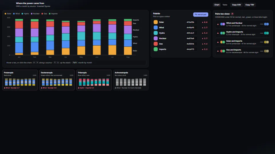
Try the second palette: chosen for colour blindness, it keeps its statuses apart for the common kinds, only just misses for the rare blue-blindness, and falls apart in black and white, as any palette does. Only the signs survive every case.
About one man in twelve, and one woman in two hundred, sees red and green as close or the same. So every status shown in colour also needs a shape, a pattern or a word: a chart's lines get direct labels, a field in error gets a message, and a busy station gets a sign.
Test the colours too. Simulate the common colour blindnesses and check that every pair of status colours stays clearly apart for each of them.
Tried on the board app. Its statuses have signs taken from road signs: a circle for flowing, a diamond near the limit, a triangle over it. Its tests simulate three colour blindnesses and hold every look's status colours at least 20 apart in CIEDE2000, which reads as "different at a glance", for each of them. The chart access entry has that simulation and check, ready to copy.
On a canvas too. A board, a map or a simulation drawn on a canvas has no DOM to label, so nothing comes for free: each status has to be drawn in more than colour and said in words. Draw a shape on the thing itself (a ring, a sign), write a short line beside it, and send a line to the page's live region when the status starts, not on every frame. The colour itself is a theme token like any other, with its own contrast test in each theme.
// A step that can't keep up: ringed, signed and said, never only tinted.
function drawBehind(ctx: CanvasRenderingContext2D, step: Step, t: Tokens) {
  ring(ctx, step.box, t.warn);                                              // the colour: a tested token
  sign(ctx, step.box, '⚠');                                                 // a shape that survives any palette
  words(ctx, step.box, `can't keep up · ${step.waiting} waiting, ${hours(step.behind)} behind`);
}
// Said once when it starts, through the polite live region; not every frame.
if (step.behind > 0 && !saidBehind.has(step.id)) { saidBehind.add(step.id); say(`${step.name} can't keep up.`); }
Tried in Spacious. Its board is drawn on a canvas. The step that can't keep up is ringed, marked ⚠, said in words under it ("can't keep up · 60 waiting, 1.3 h behind") and told to a screen reader through a live region. The warning colour is a theme token with its own contrast test in light and dark.
Names, roles and states
- (default) Use the real element first.
<button>,<a href>,<input>,<select>,<dialog>and<details>come with their keyboard behaviour and their role. Adivwith a click handler has neither. - (always) Every icon button has a name.
aria-label="Search entries"on a button that shows only a magnifier. Without one, a screen reader says only "button". - (always) Say the state.
aria-pressedfor toggles,aria-expandedfor things that open,aria-currentfor the page or step you are on,aria-selectedinside lists and tabs. A screen reader can't see the pressed look. - (default) Signs never set where the text starts. Icon glyphs and symbols (● ◆ ▲, emoji, icon fonts) differ in width and height from font to font, so text placed right after one starts at a different place on each line. Give the sign a slot of fixed width (
display: inline-block; width: 1.25em; text-align: center, or a grid column), and pair it with words, since a sign alone is not a state ("Never by colour alone"). - (default) A toggle keeps its label. A button with
aria-pressedis named for what it turns on ("Simulate a lost feed"), and its pressed state and pressed style say whether it is on. Swapping the label as well ("Bring the feed back") says the state twice, and the two disagree: a screen reader hears "Bring the feed back, pressed", and the button changes width. If the action must read differently, use two buttons, or a plain button with noaria-pressed. - (always) Describe what a drawing shows. A block in a layout sketch says "Chart, columns 3 to 8, rows 5 to 10, has a warning", not "div": that is all a screen reader has to go on.
Say what changed, once
A screen reader user can't see a toast arrive, a number change or a check fail. Put a polite live region on the page and write a line to it when something worth knowing happens:
<p class="sr-only" aria-live="polite" id="said"></p>Say what matters, and only that. Moving the pointer, selecting or scrolling isn't news; a goal reached or an upload failing is. Lines arriving close together are joined into one, not read as a queue.
Tried on the board app. Every moment and effect has a line of words, shown briefly at the foot of the board and read out. A goal reached or a bottleneck appearing is said even when effects are off or motion is reduced, because it is information. Pointer moves, clicks and selections are never said.
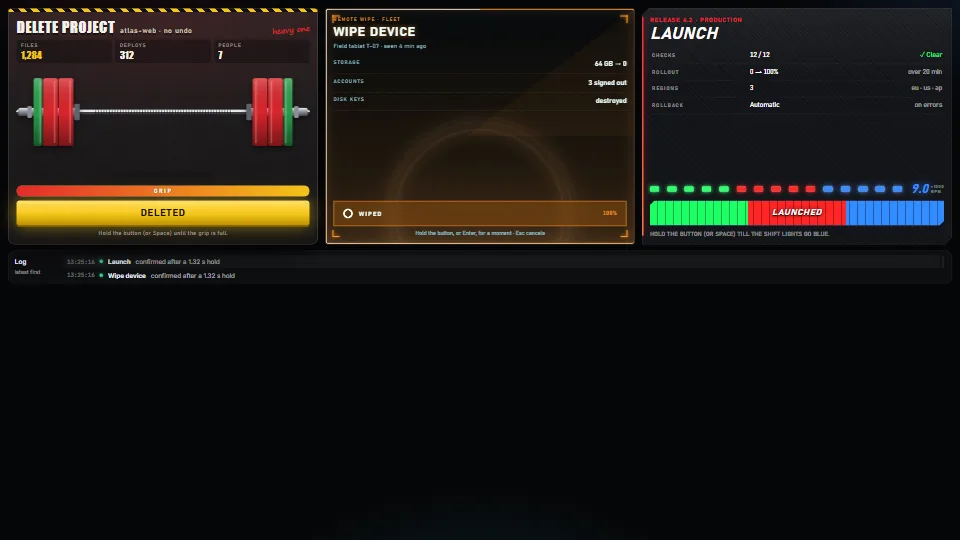
Tried here. The hold-to-confirm button announces its progress and its result. The layout studio in these playbooks says each move, swap and undo, and when there is no room.
Charts and pictures have words
- (default) Every chart is also a table, with a row per category and a column per series, which can be copied as CSV.
- (default) A graph you can travel. On a flow or a network, the arrow keys follow the connections, and each stop reads out where it is, how busy it is and where it goes.
- (default) Text stays text. Draw light, surfaces and marks on the GPU, and keep words, numbers and controls in the DOM, where they stay sharp, selectable and readable.
- (always) Pictures have alternatives:
alttext that says what the picture is for. Decoration getsalt="". A screen reader can't see the picture, only what it is told.
Tried on the game's menu mock-ups. Their brief kept text, numbers and controls in the DOM, crisp, selectable and accessible, while the GPU drew everything else, however wild the look.
Zoom, reflow and targets
- (always) At 200% zoom, or 320 pixels wide, everything still works in one column, with no sideways scrolling: the placement playbook's viewport section covers how. People who zoom have no other way to read it.
- (default) Sizes in
remfollow the reader's own font size. - (always) Targets are at least 24 pixels (WCAG 2.2's minimum), so a shaky hand can still hit them.
- (default) 44 pixels where the pointer is a finger. A fingertip covers about that much, and the platforms' own guidelines ask for it; it goes beyond WCAG AA, so a dense tool may keep smaller targets when it can say why.
Codes people type
A phone capitalises the first letter typed into a field unless told not to, so a code given out as pinecone arrives as Pinecone. Someone typing carefully is then told the code is wrong, with nothing on screen to show why.
- (default) Compare without case. Trim and lower-case both sides before comparing, on the server too. Keep the comparison constant-time when the code is a secret.
- (default) Tell the keyboard as well:
autocapitalize="off",autocorrect="off"andspellcheck="false"on the field. Do both: the hints only reach the keyboard, and the check has to accept whatever arrives. - (idea) Or pick codes that can't be mistyped. Digits only, as LAN remote's six-digit pairing code is, or an alphabet with no look-alikes, as audience vote's room codes are: they are read in capitals, and an O typed becomes 0 and an I or L becomes 1.
Tried on a shared-list app. Its join code is compared lower-cased on both sides, in constant time, "so a phone's auto-capitalised first letter doesn't lock anyone out", and its code fields switch capitals and correction off.
Check it
Automate what you can:
- (default) Contrast and palettes in unit tests, over the tokens.
- (default) Roles, names and labels with an automated checker in a browser test. It finds only some problems, but finds them every time.
Then do by hand what can't be automated, before each release:
- (default) Keyboard: use the whole screen without a mouse.
- (default) Screen reader: VoiceOver on a Mac or iPhone, NVDA on Windows, TalkBack on Android.
- (default) Zoom: at 200%, and at 320 pixels wide.
- (default) Settings: with reduced motion on, and with forced colours (Windows' high-contrast mode,
@media (forced-colors: active)).
Not yet tried here. This library's site hasn't had a full keyboard pass or a screen-reader pass yet. Its contrast is now tested and every page is checked at phone width; the keyboard and a screen reader are next.
As of November 2026: WCAG 2.2 is the current W3C standard, and the European Accessibility Act has applied since June 2025 to many products and services sold in the EU.
Parts that show it
 Data & layout
 UI & interaction
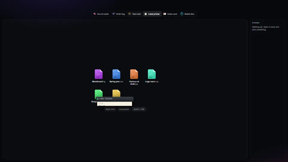
Context menus: one keyboard core, many skins
One accessible context-menu core (roles, arrow keys, type-ahead, letter keys, Esc, focus kept and given back, stays on screen, right-click, long-press and…
 UI & interaction
Hold to confirm, four ways
A safe button for actions that cost something: it acts only after being held.
 Data & layout