Placement is the part of interface design that rules can get right. Before any colour, type or effect, each function needs one home, in the place where the eye and the hand expect it, and the layout has to hold at every size. Get this wrong and no amount of polish rescues the screen. Get it right and a plain screen already feels easy.
These rules are for app-shaped screens: a workspace, a tool, a dashboard's panels. For the overall shape of any other page (a landing page, a story, a personal homepage, an event, a shop, a game), start with Page shapes and come back here for the screens inside it. The viewport, target size and "nothing widens the page" rules below hold for every shape.
The advice here comes from four projects: a board app with about 190 functions that went through a full audit of where everything lives, a game whose HUD and menus must stay out of the way of play, this library's own site, and Spacious, the owner's own app, whose values and simulation screens were built in November 2026. Each note says which.
Rules marked always protect people and hold; the rest are defaults, which you break only when you can say why, or ideas, which are suggestions.
Before you start
- (default) Every function is listed, with its one home and the exact control that reaches it.
- (default) Everything is within two clicks of the main view, or in the command palette.
- (default) Each screen and each card has one primary action, at the end of the reading path.
- (default) A menu or panel holds one kind of thing, scoped to what it acts on.
- (default) Editors open beside what they edit, never on top of it, and floating bars cover no other content where a clear side exists.
- (default) Things that grow take only free room; otherwise they keep their size and scroll or summarise.
- (default) Every per-item editor has a board-wide index (a table of every input, and a Find that knows the names) once there can be hundreds of items.
- (default) Inspectors and settings panels are rows: the name on the left with its unit, the control on the right, every control ending on one edge.
- (default) Settings set once are folded away, shut by default, and the fold says what they are.
- (default) Every live figure says whether it is live, paused or ended, and each quantity is written one way across the screen (rounding included: a clock truncates).
- (default) In a row of figures every value is the same size, on one line, under a label of the same style; extras sit on a reserved detail line under their value.
- (default) Status and alert text is a short headline and label/value facts, no line over about 60 characters; a wide box gets columns, not longer lines.
- (default) Rows that say several things about an item are a table (a column per fact, signs in a fixed slot, details on a quiet second line, numbers tabular), stacking into aligned blocks when narrow; never a sentence with brackets.
- (default) Something new that lands off screen is brought into view by the smallest move, never by recentring.
- (default) The work owns the middle of the screen; the chrome keeps to the edges.
- (default) Only the content scrolls. The bars stay put and the page never scrolls sideways.
- (default) Checked at 1280×720, on a phone with the keyboard open, and at the largest screen you support.
One home per job
Apps grow by adding a way in for each new feature, and soon the same job has three homes, each with its own interface. The board app's audit found an item's values edited in two panels, its look set from five places, and adding a chart possible from the board menu (one kind only), the command palette (every kind) and a card's own menu, but not from the toolbar where everything else was added.
The fix is a table: each job, its one home, and how you reach it.
| Job | Its home | Reached by |
|---|---|---|
| Make something new | The left toolbar, in two labelled groups: Create and Insert | Its key, or drag it onto the board |
| Change the selection | A toolbar beside the selection: about seven things, then More | — |
| Edit an item's values | One full-width Data panel | = |
| Find a value on a big board | A board-wide table of every input, which edits through the same panel's changes | Find, which knows value names |
| Anything at all | The command palette, searching commands and items | Ctrl K |
Then make the table a test. Write down, for every function, the file that holds its control and the exact text of it there. The test fails when a control disappears or a function drifts more than two clicks away:
export const REACH = [
  { fn: 'Insert a chart', home: 'Insert', file: 'src/Toolbar.tsx', anchor: 'aria-label="Insert a chart"', clicks: 2, palette: 'chart' },
  { fn: 'Lock', home: 'Selection: More', file: 'src/SelectionBar.tsx', anchor: "label: 'Lock'", clicks: 2, palette: 'lock' },
  { fn: 'Present', home: 'Top bar', file: 'src/TopBar.tsx', anchor: 'aria-label="Present"', clicks: 1 },
];
for (const r of REACH) it(r.fn, () => {
expect(readFileSync(r.file, 'utf8')).toContain(r.anchor); // the control still exists
expect(r.clicks <= 2 || r.palette).toBeTruthy(); // and it is easy to reach
});Tried on the board app. The audit mapped 190 functions on 15 surfaces, found a dozen jobs done in more than one place, and gave each a single home. The reach map has kept it that way since: a function that loses its way in is a failing test.
Plan for the big board from the start. One home per item holds only while the item is easy to find. A panel for one item doesn't grow with the board, but finding that item does: on a board of hundreds, the panel is fine and the hunt for the card is not. So every per-item editor also needs a board-wide index once there can be hundreds of items:
- A table of every input on the board. Filter it, sort it, edit in place, and the row flies to its card when picked.
- A Find that knows the values' names, not only the items' titles.
The index is a second way in, not a second home: an edit in the table is the same change, with the same undo and the same name in the history, as one made in the item's own panel.
Tried in Spacious. The owner's question was whether a value is still easy to find and change on a really big process map. The per-item panel held up; finding the item didn't. The answer, planned as its next stage, is the board-wide table and a value-aware Find; the same table is to gain a column per scenario later.
Where things go
These are the defaults. Break one only when you can say why.
| Element | Where | Why |
|---|---|---|
| Navigation between places | A left rail on wide screens, a bottom tab bar (five at most) on phones | Always in the same place, out of the work's way, and within the thumb's reach on a phone |
| App-wide actions: search, account, settings | The top bar, at the right; search also on Ctrl K / ⌘K | Where people look for them; a key for those who use them often |
| Tools that make things | The left edge, grouped and labelled | Scanned top to bottom, close to the board they act on |
| Actions on the selection | A small toolbar beside the selection; the rest under More | Where the eye already is; a short bar stays readable |
| Details and properties | A panel on the right on wide screens, a bottom sheet on phones | Beside what they describe, without covering it |
| The primary action | The end of the reading path: bottom right of a form or dialog, top right of the work it acts on; full width at the bottom on a phone | People finish reading where they act |
| Destructive actions | Away from the primary action: under More, or behind a hold or a confirmation | Hard to hit by accident, never next to the button pressed most |
| Context menus | At the pointer, kept on screen; one accessible core behind every look | Right where the hand is |
| Toasts and status | A corner that covers no work: bottom right on desktop, above the tab bar on phones | Seen, not in the way. They stack, and hold while hovered |
| A dashboard | The one number that matters top left, then a row of figures, then charts, then the table | The order people read in, from summary to detail |
| Forms | One column, labels above fields, each error under its field, the submit button at the end; nothing written until what is needed is said | One path down the page, nothing to hunt for, nothing chosen for the person |
| Inspectors and settings panels | Rows: the name on the left, saying its unit, the control on the right; every control ends on one edge; what the numbers come to, live, under them | A form is filled once, top to bottom; a panel is scanned again and again, down one column of names |
On a dashboard, the charts themselves should be quiet: direct labels instead of legends, and no frame or grid the data doesn't need. Each should also be readable as a table.
Settings in a narrow panel: rows, not sentences. A field inside a sentence ("A shift is [8] h, [2] shifts make a working day") wraps wherever the panel's width says, and its fields land anywhere. In a panel, give each setting its own row:
- (default) One column of names, one of controls, and every control ends on the same right edge. Selects fill the control column; short numbers are right-aligned boxes at its end, so their digits line up.
- (default) One setting a row, its name stating the unit ("Hours a shift"). Never a field inside a sentence.
- (default) What the numbers come to, under them, live ("16 h a working day · 80 h a working week"), so a typo shows at once.
/* Names in the first column, controls in the second: every control ends on the same edge. */
.settings label { display: grid; grid-template-columns: minmax(0, 1fr) 8.5em; align-items: center; gap: 10px; min-height: 30px; }
.settings select { width: 100%; }
.settings .number { justify-self: end; width: 4.5em; text-align: right; font-variant-numeric: tabular-nums; }
Tried in Spacious. Its working calendar was written as a sentence with three fields in it. In a 270-pixel panel it wrapped mid-sentence and the fields landed anywhere, and the selects above it had ragged widths; the owner found it hard to read from "shift" onwards. As three rows with the sum under them, it reads down one edge. The steady fields entry's knob panel is built the same way.
Suggest, never assume. Nothing is written until what is needed is said. Where the answer is the person's own word (what a group is called, a unit, a category), start empty with a hint ("pallet, box, cage…") and offer suggestions: the words already used in this document first, then common ones. A setting that needs that word waits for it rather than filling in a default. Presets belong to templates, chosen knowingly, never to a single field. The steady fields entry's word field works this way.
Tried in Spacious. Ticking "Leaves in groups" filled in "pallet" and 20 and wrote them at once. The owner asked why it gave pallets by default: what if it is something else? Now the box only shows the two fields, empty with hints, and the group is written once both are given.
Data displays
Readouts, dashboards and meters are read as facts, so they have to say honestly what they are.
- (default) A live figure says its state in words. "● live" only while it changes, then "paused" or "run ended". A live mark on a figure that stopped tells the reader the numbers are current when they are not, and a dot alone says nothing to a screen reader.
- (default) One quantity, one way of writing it, across the screen. Keep one formatter for each quantity (a rate, a duration, money), not one in each widget. A headline that says "104 /h" over a row that says "104 an hour" makes people wonder whether they are the same number. That holds for rounding too: a clock reads truncated (19:04 until the minute turns), so a time shown as "now 19:04" in one place and "updated 19:05" (rounded) in another looks like two clocks.
- (default) A row of figures lines up. Every value in it is the same size and on one line, under a label of the same style; extras (updated at, a demo clock, "try again") go on a small detail line under their own value, with its room reserved in every figure of the row, so the values stay on one baseline whatever the detail says. Three sizes in one row and a status that wraps to a second line read as a broken screen.
- (default) Several facts per row: a table, not a sentence. When each row says several things about one item (its state, where it is, a time, a count), give each fact a column of its own, never a sentence with the details in brackets ("On time (2 min behind)"). Put a sign or icon in a slot of fixed width, so every name after it starts on one edge; put a second fact about the same thing (the state's detail) on a quiet second line in its cell; set numbers in tabular figures and right-align counts and times; group the rows of one parent with a spanning header (
rowspan,scope="rowgroup"). Below a container width (about 40rem), turn the same table into stacked blocks that keep the same edges: one left edge for the names, one right edge for the times, and no sideways scroll. - (default) Status is a headline and short facts, not a sentence. Alert and status text is glanced at, not read: a short headline, then label and value pairs on one edge ("When", "Limit", "Decide by"), and any further items as a short list in a column of their own. Keep every line under about 60 characters; a wide box gets columns, not longer lines (reading text keeps its
max-width: 70ch). On a phone each fact is its label over its value. The whole sentence can still be what a screen reader hears, through the live region, and every block keeps its room. - (always) A readout never moves the layout. Changing its text (a hint swapped for a value on hover, a longer status) keeps its box: reserve the room of its longest message (resilient layout, "Live text never moves the layout"). A card that shrinks when you point at its chart moves the chart under the pointer.
- (default) Working out readouts is not running. A worker started only to compute figures must not make the interface think a run is under way. Keep "a run is going" in one flag, set only by what starts and stops a run.
// One formatter per quantity, imported by every widget that shows it.
export const perHour = (n: number) => `${grouped(n)} an hour`;
// The state in words, from the one flag a run sets.
export const stateWord = (run: { going: boolean; ended: boolean }) => (run.going ? '● live' : run.ended ? 'run ended' : 'paused');
Tried in a showcase run: the header row. A duty desk's header row held the date, the crossings left, the time now and the feed's state, with values at three sizes and the feed's status wrapping to a second line, so nothing lined up; and the header's clock said 19:04 while the feed said "updated 19:05". Now each value is one size on one line, the feed's state and "try again" sit on a detail line under it with their room kept, and every time is cut to the minute the same way.
Tried in a showcase run: the summary. The same desk's "happening now" summary was a bulleted line per route that ran a sign, the route, its state and every boat's doings into one sentence with details in brackets, and the signs' different widths started each line's text at a different place: hard to read. As a table with one row per boat (the route spanning its boats, a column per fact, the sign in a 1.25em slot, the state's detail on a quiet second line), and as aligned blocks under 40rem, it reads at a glance, with one left and one right edge at 375 pixels.
Tried in a showcase run: the attention box. The desk's attention box was one sentence of about 110 characters running across the screen. As a headline, three label/value facts on one edge and the rest as a short list beside them, its longest line is 39 characters, and on a phone each fact stacks label over value.
Tried in Spacious. A summary card kept saying "● live" while its run was paused, and its headline said "104 /h" while the row under it said "104 an hour". Now the card's corner says "● live", "paused" or "run ended" from the run's own state, and a rate is meant to be written the same way wherever it shows.
Tried on the game's menus. Every look of the career and business screens followed one brief: the rank and the net income a day are the first things you read, each card has one primary action, and anything locked says why.
Group by what it acts on
Most crowded menus mix scopes. Put each function where its scope lives:
- (default) The whole app (account, preferences, help) goes in the app's chrome.
- (default) This document (export, share, page settings) goes in the document's bar or menu.
- (default) The selection goes in the toolbar beside it.
- (default) One item's own parts go inside the item: its header, its handle, its chart.
The board app's board menu had grown to about 23 items: stress tests, inserts, flow actions, shortcuts into three other panels, files, and Delete. Sorted by scope, the inserts went to the toolbar, the stress tests became development-only, and what stayed was about the board itself.
When a panel is busy, hide depth instead of removing it. Show the presets and the few settings that matter most, with More settings… opening the rest in place. Search still finds every setting, and a link to a hidden one opens it with the rest showing.
Fold away what is set once, and say it on the fold. Settings touched once (units, a currency, a working calendar) go in a fold, shut by default, its open or shut state kept on the device. Its summary states the current settings in one line ("EUR · 1,234.5 · per hour · 16 h a day"), so they are read without opening it, and the room goes to what people work with. In a narrow panel the line goes on its own row under the fold's title: beside it, the title wraps. The exclusive accordion has a narrow variant that does this.
Tried in Spacious. Its board units sat under every list of values, taking room from the numbers people work with. Folded into "Board settings", with what they are on the fold, they take one line; the first version put that line beside the title, and in a 270-pixel panel the title wrapped.
Tried on the board app. A selected connector showed about 22 controls in its toolbar. The overhaul kept the common few in view and moved the rest (tidy, arrange, lock, duplicate, delete) under More. Eight always-open colour swatches became one swatch that opens the palette: they had been the bar's largest block.
On a board you edit, the first click selects. A chart on an editable board is an item like any other, so a click on it selects it, whichever mark the pointer was over. Only a click on a mark of a chart that is already selected acts inside it: filtering the board, say. Where nothing is being edited (a slicer, a board being presented or only looked at), the first click filters at once. Escape undoes the innermost thing first: the filter, then the tool, then the selection.
Tried on the board app. In a hand-built check, a click meant only to select a chart filtered the whole board by "Nov 2026". Now the first click selects the chart, and a click on a mark of the selected chart cross-filters the board.
Beside it, never on top
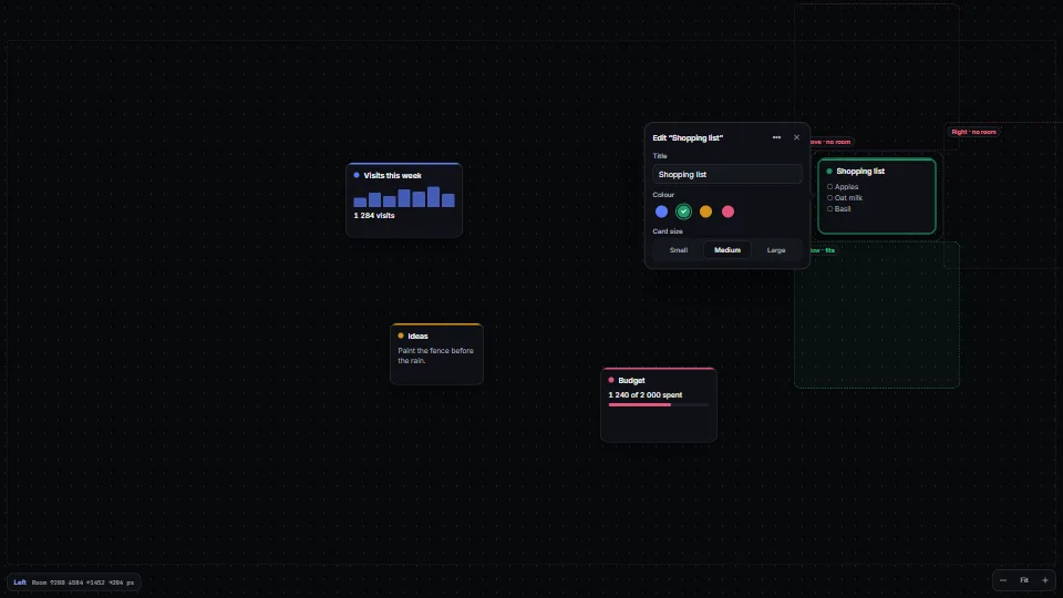
An editor that opens over the thing it edits hides the very thing you are changing. Open it beside its target instead:
- Above it by default, with a small gap and a tail pointing back at it.
- Otherwise on the side with the most room.
- If no side has room, move the view, gently, until one does.
- Failing that, dock the editor to the edge of the screen.
Working out the room on each side is four subtractions:
export function roomAround(target: Box, area: Box, gap = 14): Record<Side, number> {
  return {
    top: target.y - gap - area.y,
    bottom: area.y + area.h - (target.y + target.h + gap),
    left: target.x - gap - area.x,
    right: area.x + area.w - (target.x + target.w + gap),
  };
}
The same rule applies to the screen as a whole: the work owns the middle. A game's HUD keeps to its corners because the player is in the centre, and a board app's panels keep to the edges because the board is.
Tried on the game's HUD. A border countdown and the wait panel used to sit in the middle, over the player. They moved out of the centre, and warnings gained a coloured edge and plain words in place of a large glow.
Not on top of anything else, either. A floating toolbar above the selection can still land on the line coming into it, or on the card above. Prefer the side that covers nothing: above by default, below when above covers something and below doesn't. Keep it on screen, and slide it clear of the app's own bars. Let the app say what counts as covered (covers(box)), since only it knows what is on the board. Three kinds of thing to keep clear of, three inputs: chrome along a whole edge comes out of the area it may use; chrome along part of an edge (a side rail) is a box to slide clear of; content is what covers answers for.
Tried on the board app. Building a flowchart by hand, its selection toolbar sat over the line between two cards and over the Create bar at the left. It now goes under the selection when over would cover something, and slides clear of the bar.
Things that grow must not crowd their neighbours. A card that grows to fit its values, or a panel that opens to explain one, takes only free room. Grow into the space around it while there is some; otherwise keep the size and let the content scroll, or summarise it ("and 4 more"). A panel about something on the board (why a number is what it is, say) is an editor in all but name: placed by the same four steps, beside what it points at and never over it, and docked to the edge when no side has room.
Tried in Spacious. Cards grew to fit their values and pushed into the next card, and a panel explaining a figure opened over the very cards it was explaining. Both now keep to free room, the panel with a docked fallback; short windows are still the tight case.
Bring new things into view by the smallest move. When something the user just made lands off screen, glide the view by as little as shows it, clear of the app's own bars, at the same zoom. Recentring on it moves everything else the user was looking at and loses their place. Fit it to the view only when it can't show at the current zoom.
Tried on the board app. A card added with "+" past the screen's edge was named unseen. Now the board glides just far enough to show it clear of the toolbars round the edge.
The viewport
Interactive figure “viewports”: it runs in the full playbook in the library.
Height runs out first. A 1280×720 laptop with a browser's bars leaves about 600 pixels. Plan for that: tall toolbars close up on short screens, and only the content area scrolls.
/* A 642 px toolbar ran off short screens. Here it closes up; tooltips keep the names. */
@media (max-height: 760px) {
  .toolbar .group-label { display: none; }
  .toolbar button { height: 32px; }
}
Phones move under your feet. The address bar grows and shrinks, the notch and the home bar cover the corners, and the keyboard takes about 40% of the screen. Handle all three:
<meta name="viewport" content="width=device-width, initial-scale=1, viewport-fit=cover, interactive-widget=resizes-content">.app { height: 100dvh; } /* the visible height, not 100vh */
.tab-bar { padding-bottom: env(safe-area-inset-bottom); } /* clear of the home bar */
.top-bar { padding-top: env(safe-area-inset-top); } /* clear of the notch */
.menu { max-height: calc(100dvh - 48px); overflow: auto; } /* a menu never runs off */While someone types, the field and the button that submits it stay above the keyboard, and the tab bar steps aside.
Thumbs reach the bottom. On a phone held in one hand, the bottom middle of the screen is easy to reach and the top corners are hard. Put frequent actions low. Rare and destructive ones can sit high.
Targets are at least 44 pixels. Apple asks for 44 points and Material for 48. WCAG 2.2 sets 24 as the minimum for its AA level. Make targets bigger where the pointer is a finger, and never put information only on hover:
@media (pointer: coarse) { .icon-btn { min-width: 44px; min-height: 44px; } }
@media (hover: none) { .hint-on-hover { display: none; } .hint-inline { display: block; } }
Components lay themselves out. A card that sits in a wide column one day and in a narrow sidebar the next should respond to its own width, not the window's. Use a container query:
.card-host { container-type: inline-size; }
@container (max-width: 360px) { .card { grid-template-columns: 1fr; } }
Nothing widens the page. A grid track of 1fr grows to fit its longest word or widest code block, and the whole page scrolls sideways. Use minmax(0, 1fr), and give grid and flex children min-width: 0.
Tried here. Adding Library and Playbooks to this site's top bar pushed it past a 375-pixel phone. Now search shrinks to an icon below 640 pixels and the name beside the logo goes below 420. The entry pages had scrolled sideways on phones too, until their grids moved to
minmax(0, 1fr).
Check it at these sizes
| Size | Why |
|---|---|
| 1280×720 | The smallest common laptop; the game's rule was that nothing breaks here |
| 1440×900 and 1920×1080 | Where most desktop use happens |
| 2560×1440 and up | Lines stay readable (60 to 80 characters) and nothing stretches across the whole width |
| 390×844, and 375×667 | A current phone, and a small one |
| The phone with its keyboard open | Every form, every search field |
| 200% zoom, or 320 pixels wide | WCAG's reflow test: everything still works in one column |
Check light and dark at each size, and automate what you can. A headless browser can take a screenshot at every size in one run, and one line catches the sideways scroll:
document.documentElement.scrollWidth <= innerWidth // no sideways scrollAs of November 2026:
dvh,env(safe-area-inset-*)and container queries work in every current browser. Chrome on Android honoursinteractive-widget; where it isn't supported, thevisualViewportAPI tells you how much the keyboard covers.
Parts that show it
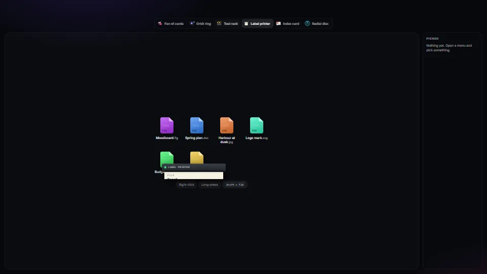 UI & interaction
Context menus: one keyboard core, many skins
One accessible context-menu core (roles, arrow keys, type-ahead, letter keys, Esc, focus kept and given back, stays on screen, right-click, long-press and…
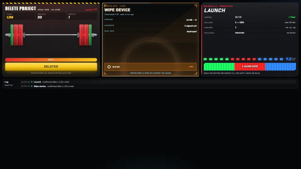 UI & interaction
Hold to confirm, four ways
A safe button for actions that cost something: it acts only after being held.
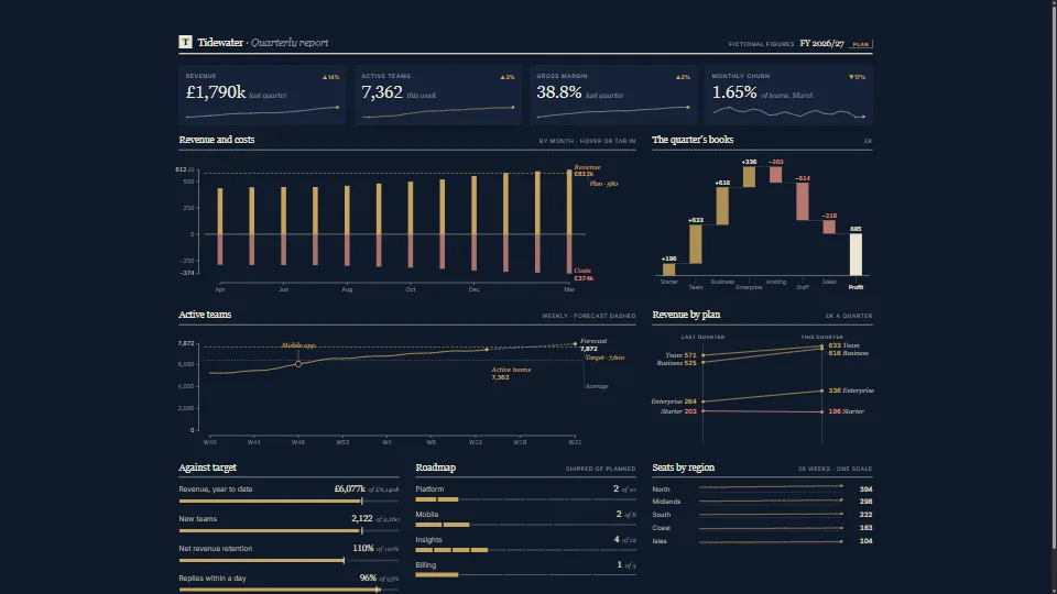 Data & layout
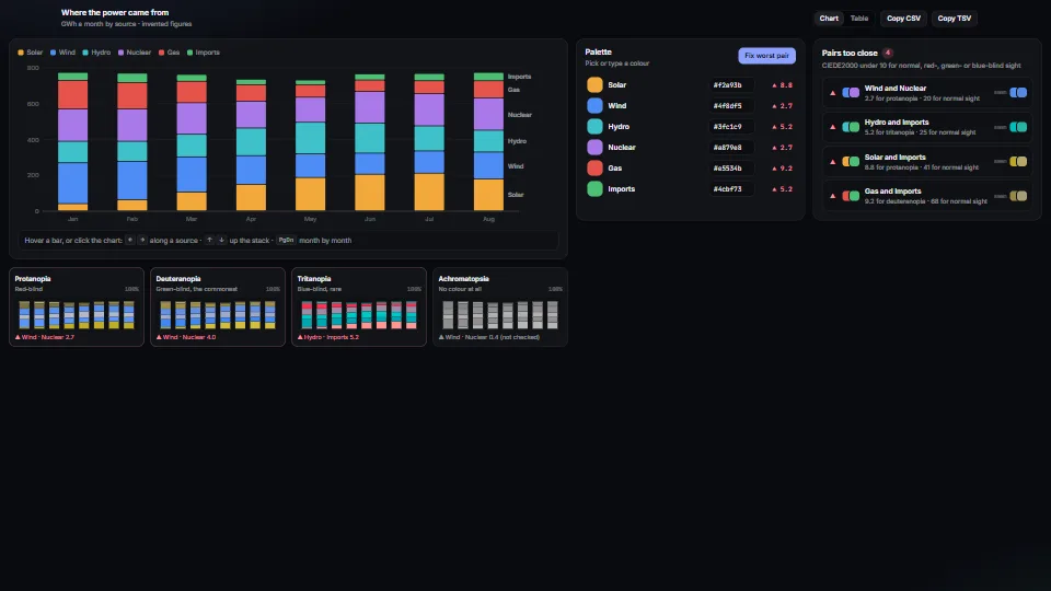 Data & layout
 UI & interaction
Micro-interactions pack
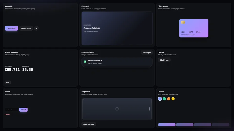
Magnetic buttons, springy flip cards, tilt with sheen, rolling and split-flap numbers, fling-to-dismiss, toasts, toasts that hang on a string and swing to…
 Data & layout
Beside, never over: placing editors and popovers
Puts an editor, popover or inspector beside the item it edits, never on top of it.
 UI & interaction
Interactions with zero JavaScript
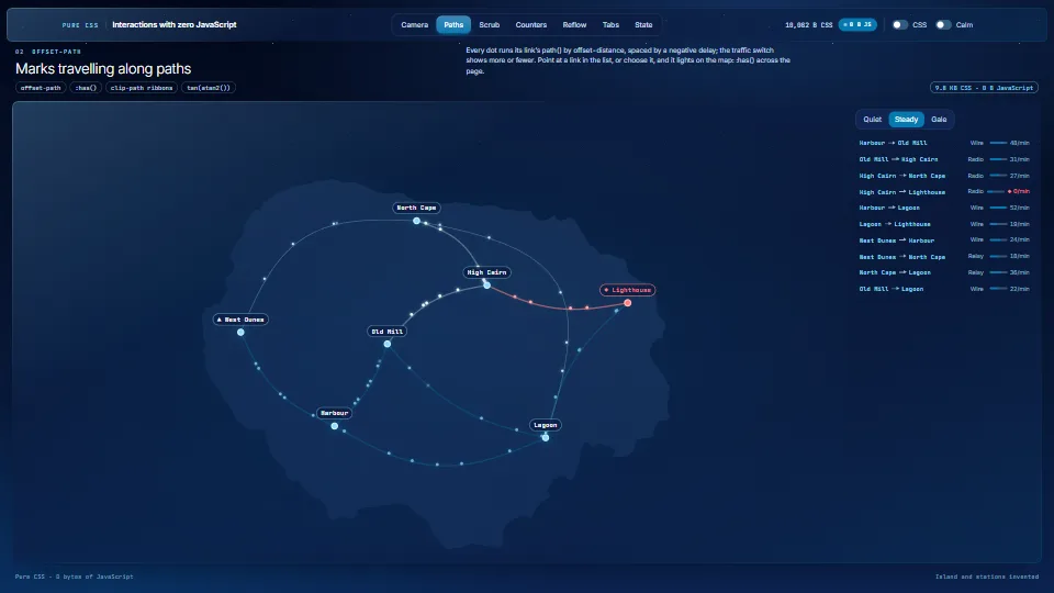
Eight patterns that run with no script, each one CSS file and the markup it reads.
 UI & interaction
Fields that don’t fight you
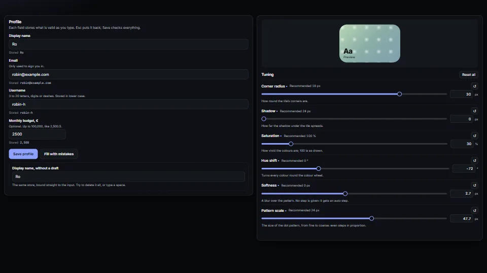
Form fields that behave: a draft kept apart from the store (typing never fights a re-render, Esc puts it back, an emptied name comes back), messages tied to…