A layout that looks right with the sample data in a mock-up breaks on its first real customer: a long name, a translation, a number with ten digits, or nothing at all to show. Build for the content you will actually get, and test with the worst of it.
Placement and layout says where things go and how the screen adapts to its size. This playbook is about what goes inside: content that is longer, shorter, emptier or stranger than the design expected. Its lessons come from this library's own breakages, from a board app's panels and menus, and from a game HUD checked at every size from a small laptop to 4K.
Rules marked always keep the screen still under the reader and within reach, and they hold; defaults are where to start, and you may break one when you can say why; ideas are suggestions.
Before you start
- (default) Every piece of text can be twice as long as the sample, or 40% longer once translated, and still fit.
- (default) No single word or link can widen the page.
- (default) Grid and flex children can shrink:
minmax(0, 1fr)andmin-width: 0. - (default) Heights grow with their content:
min-height, never a fixedheight, on anything holding text. - (default) Every list and panel has an empty, a loading and an error state, and works with one item and with a thousand.
- (default) Numbers use tabular figures and have room for their longest value.
- (always) A control that shows only in some states (back to now, clear filters, undo, try again) keeps its room:
visibility: hiddenor a reserved slot, nothidden; toggling the state moves no box outside it, because a jump moves what someone was about to read or press. - (always) A table that updates while it is read has fixed columns sized for its longest content (
table-layout: fixed, a<colgroup>) and rows that keep their height; stepping it through its states moves no column edge, because an edge that moves loses the reader's place. - (always) Text that changes while the screen is in use (readouts, hover hints, status lines) keeps its box: the room of its longest message is reserved, so hovering or focusing never resizes anything. A box that resizes moves what the reader is pointing at.
- (default) Pictures keep their shape and have a fallback when they are missing.
- (default) It works right to left, and with the reader's text at 200%.
- (default) A full-screen app root clips with
overflow: clip, so a caret or focus off its edge can't scroll it. - (always) A box that scrolls on one axis has room inside it for focus rings (padding) and for anything that overhangs its track (end margins of half the thumb plus the ring): it clips on both axes. A cut ring hides where a keyboard user is.
- (default) Every part whose stylesheet sets
displaystill hides with thehiddenattribute: the base stylesheet says[hidden] { display: none }for it, written to win (.root:where([hidden]), .root :where([hidden]) { display: none !important; }).
Design for the content you will get
Before drawing a component, list what can go in it:
- Long: a name with no spaces, a pasted link, a German compound word.
- Translated: German and Finnish text often runs 30 to 40% longer than English; Chinese and Japanese can be much shorter.
- Big and small: ten-digit numbers, negative numbers, zero, and values with no unit.
- Missing: no picture, no description, no data yet.
- Many: one item, then a thousand.
- Right to left: Arabic and Hebrew turn the whole layout around.
Give missing things a sensible default. A blank name is not "Untitled": it is whatever the thing is most likely called.
Tried on the board app. Its values panel titled every smart shape "Untitled item", although each one had a perfectly good name in its header. The panel now shows the header's title.
Stress a card
Interactive figure “stress-a-card”: it runs in the full playbook in the library.
Turn Robust CSS off to see the same card with the CSS most components start with: a fixed height, text that never wraps, and grid columns that can't shrink. Then turn it back on and push it: the card above counts anything that spills out of it, and with robust CSS that count stays at zero.
Tried here. A script ran this card through every combination of its controls at nine widths: 2,592 in all. With the starting CSS, seven in ten spill. An earlier run, at five widths, caught the robust card failing too: 24 combinations, every one German at 200% in the least room. Its own grid had no column template, so its single column was
auto, and the button labelled "Weitere Aktionen" pushed it wider than the card. One line,grid-template-columns: minmax(0, 1fr), took it to zero.
The rules that keep it whole
.card { container-type: inline-size; min-height: 7rem; padding-inline: 1rem; text-align: start; }
.card-body { display: grid; grid-template-columns: auto minmax(0, 1fr) auto; gap: 0.75rem; }
.card-title {
  overflow-wrap: anywhere;                       /* a word with no spaces still wraps */
  display: -webkit-box; -webkit-line-clamp: 2; -webkit-box-orient: vertical; overflow: hidden;
}
.card-value { font-variant-numeric: tabular-nums; overflow-wrap: anywhere; }
.card-actions { display: flex; flex-wrap: wrap; gap: 0.5rem; }
.card-thumb { aspect-ratio: 1; object-fit: cover; }
@container (max-width: 20em) { .card-body { grid-template-columns: auto minmax(0, 1fr); } }  /* in em: larger text gets there sooner */
@container (max-width: 11em) { .card-body { grid-template-columns: minmax(0, 1fr); } }- (default)
minmax(0, 1fr), not1fr. A plain1frtrack never shrinks below its longest word, so one long name pushes the whole page sideways. The same goes for flex children: give themmin-width: 0. - (default)
overflow-wrap: anywherelets a word with no spaces break when it must. - (default)
min-height, notheight. Text at 200%, or a third line, then makes the card taller instead of spilling out of it. - (default)
flex-wrap: wraplets buttons move to a second row instead of squeezing their labels. - (default) Logical properties (
padding-inline,margin-inline-start,text-align: start) turn around by themselves in a right-to-left language. - (default) A container query lets the card stack when its own space is narrow, wherever it is placed. Write its steps in
em, so that text at 200% reaches them sooner. - (default) Sizes in
remandemfollow the reader's text size. - (default)
hiddenloses to your owndisplay. The browser hides[hidden]with its own stylesheet, which anydisplay: flexof yours beats, so a part with adisplaystays on screen withhiddenset. Say it once in the component's base stylesheet, for the root and everything in it, with!importantso no look can bring it back:.panel:where([hidden]), .panel :where([hidden]) { display: none !important; }. Parts that live outside the root (a popover moved to the body) need their own line. In Spacious, a panel's tools (display: flex) stayed visible withhiddenset; the library's tests now check every entry's stylesheets for the rule. - (default)
overflow: clip, nothidden, on a fixed full-screen root. An element withoverflow: hiddenis still a scroll container: the browser scrolls it to bring a caret or a focused element into view, and nothing in your code ever scrolls it back.clipcuts the same way but can't be scrolled at all.
- (always) A box that scrolls on one axis clips on both.
overflow-x: autoturnsoverflow-yfromvisibletoautotoo (CSS allows no scroll one way and spill the other), so the box cuts whatever reaches past its edges either way: a focus ring above or below a control, a slider's thumb, a "now" marker or a handle that hangs over the end of its track. Keep room inside the box for them: a cut focus ring hides where a keyboard user is. Pad it on the other axis by at least the ring's reach (outline width plus offset, or the halo's spread), and give a track whose thumb can sit at either end a margin of half the thumb plus the ring at each end, on the scale under it as well, so they line up. Then a ring fits at every position, and nothing at the end adds a sideways scroll.
/* Scrolls sideways on narrow screens; the ring (2 px outline, 2 px offset, 4 px halo) needs 6 px above and below. */
.timeline-scroll { overflow-x: auto; padding-block: 0.5rem 0.25rem; }
/* Half the 36 px handle, plus the ring: the handle at the first and last hour stays inside. */
.timeline-track, .timeline-scale { margin-inline: 30px; }
Tried in a showcase run. An agent building a duty desk through the store put the day's timeline in
overflow-x: autoso it could scroll on a phone. The scrub handle's focus ring lost 6 pixels at every time, and at the last hour half the handle hung 16 pixels past the track, was cut there, and added a sideways scroll. Padding inside the scroll box and an end margin of 30 pixels fixed both.npm run auditnow reports a ring a box cuts (ring cut).
Tried on the board app. Its board fills the window,
position: fixed; inset: 0; overflow: hidden. Typing on a card past the right edge scrolled that root sideways to show the caret, and the whole interface, toolbars and all, sat 124 pixels to the left until a reload. One word,clip, fixed it.
Tried here, the hard way. This site's pages scrolled sideways on phones until its grids moved from
1frtominmax(0, 1fr)and their children gotmin-width: 0. Its top bar overflowed a 375-pixel phone the day it gained two links. Now search shrinks to an icon, and the name beside the logo goes on the smallest screens.
Above the keyboard on iOS
A phone app that fills the screen usually has a bar at the bottom: the field you add with, a send button. When the keyboard opens, iOS keeps the layout viewport at full height and scrolls the page under the keyboard instead, so 100dvh doesn't shrink and the bar ends up hidden. Size the app to what is visible instead, from visualViewport:
const vv = window.visualViewport;
if (vv) {
  const fit = () => {
    document.documentElement.style.setProperty('--vvh', `${vv.height}px`);
    // iOS may have scrolled the page to show the field: put it back, so only the list scrolls.
    if (vv.offsetTop > 0 && document.activeElement?.matches('input, textarea')) scrollTo(0, 0);
  };
  vv.addEventListener('resize', fit);
  vv.addEventListener('scroll', fit);
  fit();
}
.screen {
height: var(--vvh, 100dvh); /* the visible height; dvh where there is no visualViewport */
display: grid; grid-template-rows: auto minmax(0, 1fr) auto; /* bar, list (scrolls), add bar */
}The bar then sits right above the keyboard, and only the list scrolls. Phone app shell has this with the rest of an installable app's frame.
Tried on a shared-list app. Its screens are
var(--vvh, 100dvh)tall, with the add bar in the last grid row. On an iPhone the bar sits right above the keyboard while someone types, and only the list scrolls.
Cut on purpose
Sometimes text has to be cut. Do it deliberately:
- (default) Cut at a sensible point, and keep the whole. Put the full text in a tooltip and in the accessible name.
- (default) A shorter label beats a cut one. Where "Primary action" won't fit, write "Primary", not "Primary a…".
- (default) Never cut a number. Show a shorter form (1.2 M) with the exact value one hover or focus away.
Tried here. The chips in the performance playbook's figure use an effect's name up to its first "with" or comma, so "GPU rain and snow with a seeded weather model" becomes "GPU rain and snow", with the full name as its tooltip. The layout studio's blocks pick the label that fits their width.
Sizes that bend, within limits
- (default) Fluid between two limits.
clamp(min, preferred, max)grows with the screen but never past what still reads well. - (default) Reading lines of 60 to 80 characters:
max-width: 70chon text. - (default) Popovers sized to the screen, never off it:
width: min(560px, 100vw - 2rem)andmax-height: calc(100dvh - 4rem), with their contents scrolling inside. - (default) Floating things stay on screen. Menus and editors measure the room around them and pick a side that fits, or shrink, or dock.
Tried on the game's HUD. Its whole HUD is measured in one unit,
clamp(1px, 0.0651vw, 1.6px)times the player's own interface scale: 1 pixel at a 1536-pixel-wide screen, growing modestly towards 4K, and held between 1 and 1.6 pixels before the player's scale. A review captured it at 1280×720, 1600×1000, 1920×1200 and 3840×2160.
Tried on the board app. Its Insert menu is
min(560px, 100vw − 120px)wide and at mostmin(620px, 100vh − 80px)tall, scrolling inside. An item's editor opens beside the item where there is room, shrinks if it must, moves the board to make room, and docks to a side when nothing else works.
Every state has a design
A component isn't finished until each of these has been designed:
- (default) Empty. Say what the space is for and the one thing to do first: "Select a card to see its values". A blank panel looks broken.
- (default) Loading. Placeholders the size of what is coming, so nothing jumps when it arrives.
- (default) Error. Say what happened and what to do next, with a way to try again. Keep whatever was already showing.
- (default) Partial. Some of the data arrived. Show it, and say what is missing.
Tried on the board app. Its interface plan gave each panel a line saying what it is for and the one thing to do first, and a board's first visit a four-line hint that is dismissed once.
A restyle moves nothing
A theme switch, a new look, a hover, a focus ring, a picked tab: each of these repaints, and none of them may move a box. A picked tab that turns bold pushes its neighbours along; focus drawn as a thicker border makes the field's text jump; a dark theme with a different font weight or line width reflows the whole page the moment someone switches. And a restyle never weakens a warning: what was painted in the danger colour stays in it.
- (default) Draw states with paint: colour, background, an inset
box-shadowring,outline,text-shadow,filter. Notfont-weight,border-width,paddingorletter-spacing. - (always) Reserve what a state needs. A border that lights up on focus is there at rest, in a quiet colour. A label that must turn bold reserves its bold width. A state that takes more room moves its neighbours under the pointer.
- (always) A theme changes colours, never sizes. Light and dark share every length, weight and face, so switching never reflows the page under the reader.
- (default) Danger keeps its colour. An error, a destructive button or a failed toast keeps
--bad(or whatever the design calls it) in every look and mode, and that colour still reads as danger. - (default) Check it by measuring. Read every element's box, restyle, read again: nothing may differ.
// Every box in a root, before and after a restyle: the moved count should be 0.
const boxes = (root) => [...root.querySelectorAll('*')].map((el) => {
  const r = el.getBoundingClientRect();
  return `${r.x},${r.y},${r.width},${r.height}`;
});
const before = boxes(app);
document.documentElement.dataset.theme = 'dark';      // or pick a tab, focus a field, switch the look
await new Promise((r) => requestAnimationFrame(() => requestAnimationFrame(r)));
const moved = boxes(app).filter((b, i) => b !== before[i]).length;
Leave out what moves on its own (a toast's countdown) and what sits under a transform (a lift on hover is paint too).
Tried on the game's HUD. Its restyle was checked by a probe that rendered every HUD state, from idle to downed, at 1080p and at phone width, before and after the new style, and failed on any box that moved or any danger cue whose paint changed. It also pinned the two warning colours to exact values, so the restyle could not soften them.
Tried here.
npm run probe:looksdoes the same for every look in this library: it puts the real components through 23 states with real input (hover, keyboard focus, picking, opening, an invalid number, a held button, a failed toast), switches light and dark in each, and compares with the plain look. Its first run, over six looks at a desktop and a phone size, found no box that moved, but four looks that weakened a danger cue: two painted the hold-to-delete button's border in their ink instead of the danger red, one did the same to a failed toast, and two new looks repainted that button with their hover style while it was being held. One:not(.lk-hold)fixed the new ones.
Live text never moves the layout
A readout under a chart, a value beside a slider, a status line, a hover hint: text that changes while someone is using the screen must never change a box's size. Pointing at a data point that makes its card shorter moves the very chart being pointed at, and the neighbours with it; it reads as a glitch every time.
- (default) Reserve the room of the longest message. Put every message the readout can show in the same grid cell, all hidden but the current one, so the cell is always as big as the longest. It holds at every width and in every look, because the browser measures the real text.
- (default) Or give it a fixed number of lines, when its messages are not known in advance:
min-block-sizeinlh(say,2lh) and a clamp at the same count. - (default) Figures change in place. Tabular figures, and a width for the longest value (
chunits), so 9 → 10 does not push its label along. - (always) A control that comes and goes keeps its room. A button that shows only in some states ("Back to now", "Clear filters", "Undo", "Try again") stays laid out and is hidden with
visibility: hidden, which keeps its box and still takes it out of the tab order and the accessibility tree; or it sits in a slot whose room is kept. Neverhiddenordisplay: nonefor it, unless the change it answers has already moved the layout (a panel that opens anyway). A button taller than the line beside it otherwise pushes everything under it down and back up on every change. loading-states'notice: 'reserved'does this for its notes. - (always) A table that updates while it is read has fixed columns. With the browser's automatic table layout, every new text re-measures the columns ("Late by 5 min" for "On time"), so the inner column edges move on each update: dizzying to watch. Use
table-layout: fixedwith a<colgroup>: each column as wide as the longest text it can ever hold (inch, or measured once from its longest value), and one flexible column takes the rest. Keep cells on one line, or reserve the lines a cell may wrap to (min-block-size: 2lh), so no row's height changes either. The narrow stacked form follows the same rule. - (default) A resting hint is a message too. "Point at a month to see its value" is often the longest thing the readout says, and the one most often forgotten when sizing it.
- (default) Check it by measuring, as for a restyle above: read the boxes, hover or focus the thing, read again: nothing may differ. For a view that steps through states (a clock, a look-ahead, a live feed), step it through all of them and record every column edge and row top: each may have one position only. Do the same for every state that shows or hides a control: no box outside the control may move.
/* Columns fixed for their longest content: new text never moves an edge. */
.live-table { table-layout: fixed; width: 100%; }
.live-table col.state { width: 14ch; }   /* "Late by 15 min", its longest */
.live-table col.time { width: 6ch; }
.live-table col.where { width: auto; }   /* the one flexible column */
.live-table :is(td, th) { white-space: nowrap; overflow: hidden; text-overflow: ellipsis; }
/* Every message stacked in one cell: the cell is the size of the longest, only one is visible. */
.readout { display: grid; }
.readout > * { grid-area: 1 / 1; }
.readout > [aria-hidden='true'] { visibility: hidden; }// The messages the readout can show, hidden, plus the live one on top.
const rest = 'Point at a month, or focus the chart and use the arrow keys.';
const sizes = [rest, ...months.map((m, i) => say(i))].map((text) => span(text, { ariaHidden: 'true' }));
const now = span(rest);
readout.append(...sizes, now);
chart.onInspect((at) => (now.textContent = at ? say(at.i) : rest));Tried in a showcase run: the table. A duty desk's "now" table used the automatic table layout, so each step of its look-ahead ("Sailing to …" for "At …", "Late by 5 min" for "On time") moved its column edges. With fixed columns from a
<colgroup>, measured over all 205 five-minute steps at 1440, 1024 and 375 pixels: one position per column edge, one top per row, one table height, no text cut.
Tried in a showcase run: the button. The same desk's "Back to now" button was
hiddenat the present time and shown while looking ahead; taller than the hint beside it, it moved the timeline, the table and the footer down and back up on every click. Kept laid out and onlyvisibility: hiddenat now, measured at now, ahead and back again: every box below it keeps its place and height.
Tried here. The looks gallery's chart card swapped a two-line hint ("Point at a month, or focus the chart and use the arrow keys.") for a one-line value ("Mar: 14 visits") on hover, so in a narrow column the card shrank by 20 pixels and the chart moved under the pointer, in every look. Stacking every message in one grid cell fixed it.
Test with ugly content
- A sheet of every state. One page renders each component with the worst content you can think of, in every state: what the game calls its HUD sheet, with idle, active, warning and danger examples for every widget.
- Fake translations. Replace every string with a longer, accented version (
Settings→[Śéţţîñĝš ~~~~]), and anything still in plain English was missed. - An overflow finder, run at each size, in a browser test or by hand from the console:
// Elements whose content is wider than their box, where nothing was meant to scroll or clip.
[...document.querySelectorAll('body *')].filter((el) => {
  const { overflowX } = getComputedStyle(el);
  return el.scrollWidth > el.clientWidth + 1 && overflowX === 'visible';
});
Tried here. Every playbook here was checked at 1280 and at 375 pixels wide, with a check for sideways scrolling. It caught the top bar, a figure whose labels shrank to 6 pixels on a phone (it now draws a compact version), and a figure that left a tiny drawing in a tall, empty box. On this very page, it caught a button whose class,
switch, picked up the site's own toggle style and shrank to a 36-pixel pill with its label spilling out. Prefix a component's classes with its own name.
As of November 2026:
overflow-wrap: anywhere,overflow: clip, container queries, logical properties and-webkit-line-clampwork in every current browser; the standardline-clampproperty is still on its way.
Parts that show it
 Data & layout
 UI & interaction
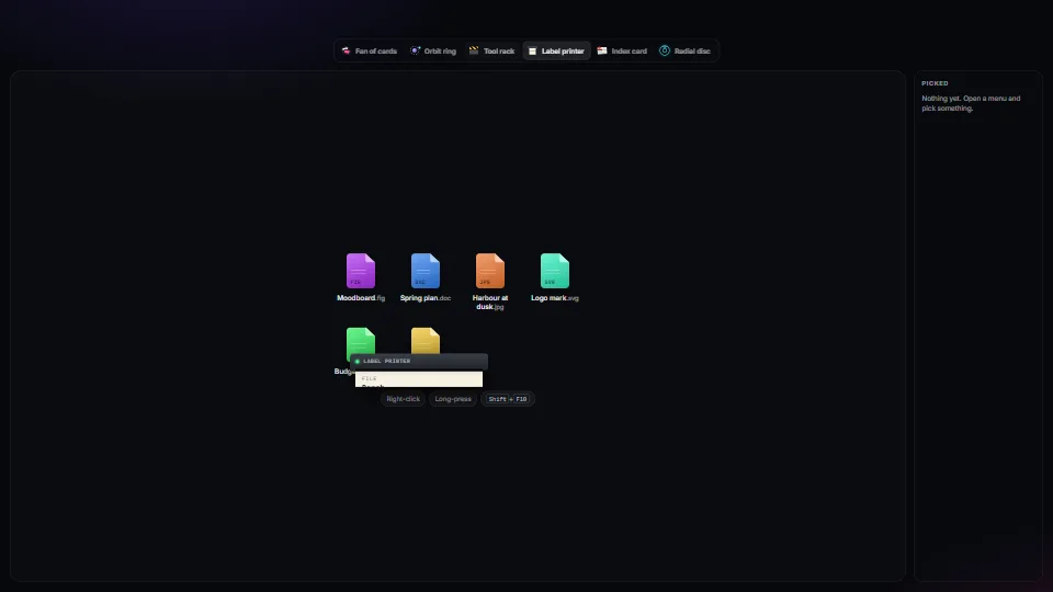
Context menus: one keyboard core, many skins
One accessible context-menu core (roles, arrow keys, type-ahead, letter keys, Esc, focus kept and given back, stays on screen, right-click, long-press and…
 UI & interaction
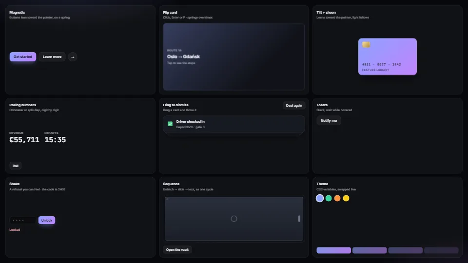
Micro-interactions pack
Magnetic buttons, springy flip cards, tilt with sheen, rolling and split-flap numbers, fling-to-dismiss, toasts, toasts that hang on a string and swing to…