Placement and layout says where things go. This playbook is where you try it. Sketch a screen on three grids, with that playbook's rules checked as you go, and hand the result to an agent as a prompt it can build from: what each block is for, where it sits at each size, and the CSS that puts it there.
Everything here is a default or an idea: start from it, and break a default when you can say why.
Before you start
- (default) You can say in one sentence what the screen is for, and name its one primary action.
- (default) You have listed the blocks it needs, and nothing more.
- (default) Each block has a place on every screen size, or is hidden there on purpose with another way to reach it.
- (default) Every check passes, or each one left is a decision you can explain.
- (default) Each block has a line of notes: what goes in it and how it behaves.
- (default) The agent gets the real labels and data with the prompt, not placeholder text.
- (default) What the agent builds is checked against the sketch at each size before it is filled in.
The studio
Interactive figure “studio”: it runs in the full playbook in the library.
- Pick a template: Dashboard, Editor, Settings or Reading. Each one passes every check to begin with.
- Switch the screen between Desktop, Tablet and Phone. Each has its own grid, and a block can be in a different place on each, or hidden. A badge counts the warnings on each screen.
- Drag a block to move it. Drop it on another block and the two swap. Select a block and drag its corner to resize it.
- Change a block in the panel: its kind, its name and the notes the agent will read. "Hide on this screen" takes it off one grid; the chips under the drawing put it back.
- Copy the export: the agent prompt, the CSS on its own, or the layout as JSON.
Full screen gives the grid the whole window. Undo and redo say what they will undo, and the sketch stays in this browser between visits. Everything works from the keyboard too: Tab to a block, arrows move it, Shift with the arrows resizes it.
A grid, not a drawing
Blocks snap to a grid and never overlap, so each screen is exactly a CSS grid-template-areas. The sketch is the layout, and nothing is lost between your drawing and the agent's code. The grids have the common column counts: 12 for a desktop, 8 for a tablet, 4 for a phone.
The export tidies the grid as it writes it:
- Merged tracks. Neighbouring columns or rows that hold the same blocks become one track, so a 12-column sketch often comes out as three or four columns.
- Bars size to their content. A row holding only one-row bars (a top bar, filters, a tab bar, a primary button) becomes
auto. - Rails and panels get widths of their own. A column holding only navigation becomes 240 pixels wide, or 72 where the sketch makes it narrow. A toolbar becomes 56 pixels and a details panel 320. Everything else shares what is left, in the sketch's proportions.
- Content scrolls; the frame doesn't. The app is
100dvhtall, content blocks getoverflow: auto, and the top bar and tab bar keep clear of the notch and the home bar.
What the checks look for
The checks are the placement playbook's rules, run on every change. A warning is something to fix. A note is something to decide on purpose.
| Check | Why |
|---|---|
| Exactly one primary action on each screen | People finish reading where they act; two primaries means neither is |
| On the phone, the primary action is in the bottom half | The thumb reaches the bottom easily and the top hardly |
| No side rails, and no details beside the work, on the phone | A phone has room for one column; a rail or panel squeezes the work |
| The top bar is at the top, the tab bar at the bottom | Where everyone looks for them |
| Nothing in the frame is bigger than the content | The work owns the screen |
| Each block is big enough for its kind | A chart under about 280 pixels wide or a button under 44 tall stops working |
| Navigation and content that one screen hides | Hidden things are hard to find, so a tab or a sheet should keep them |
| More than a third of the grid empty | Fine for margins, but worth a look |
A "To check" list tied to its place
The studio's checks are one case of a pattern worth building into any editor whose work has a timeline or a run of parts: work out what is wrong from the content itself, every time it changes, and attach each finding to the step it belongs to.
- (idea) Computed, never stored. Validation, a missing file, a camera path that hits something, a step over its GPU budget: worked out again on each change, so a fixed problem simply disappears.
- (idea) Shown where it lives. Each step carries its own warnings in a few words, with the full text as its tooltip.
- (idea) One count in the top bar: "3 to check", or "All clear" when there is nothing.
- (idea) Grouped as things to fix. One missing file used by seven steps is one thing to fix, listed with its seven places.
- (idea) A click goes there. Picking a warning selects its step, and opens the tool that fixes it where there is one.
- (idea) An empty state that says what was checked: "Nothing is over budget, missing or colliding."
Tried on a show app. Its editor's list "To check before the show" comes from one function, run again when the show or its files change. Each warning carries the beat (one step of the show) it belongs to and appears on that beat's card in the running order. A click on a camera warning selects the beat and opens its camera.
Handing it to an agent
The prompt gives the agent everything the sketch knows: each block with what it is for and where it sits on each screen, the CSS, the rules from the placement playbook, and any checks still open. Add what only you know: which components to use, the real labels, and where the data comes from. Ask for the empty skeleton first:
Build the dashboard below in src/pages/Dashboard.tsx, with our Card, Button and Table components.
Start with the grid and empty blocks only. I'll check it at each size before you fill them in.

(the studio's prompt, pasted here)
A skeleton is quick to check, and wrong placement is cheap to fix before anything is built inside it. Once it holds at every size, the agent fills one block at a time.
Keep the JSON beside the code, for example in docs/layouts/dashboard.json. The next change to the screen, by you or by another agent, then starts from the agreed layout instead of from what the code happens to do.
Not yet tried here. The studio is new, and no screen in this library has been built from its prompt yet. What is checked: tests confirm that every template passes its own checks, that every exported grid has one name per cell in every row, that moves and resizes never overlap two blocks, and that hidden blocks get
display: noneon their screen. Undo is this library's labelled undo.
Where it stops
- It places regions, not components. What goes inside a block is its notes and the agent's work.
- Three grids, three sizes. Real screens also pass through the widths between them, so each block should lay itself out with a container query, as the placement playbook describes.
- Rows are proportions. Real content will be taller or shorter than the sketch. That is why only the content scrolls.
- Small screens. The studio is made for a mouse, a trackpad or a tablet. On a phone it works, but its desktop grid is small: sketch the phone screen there, or use full screen.
- No layers. Sheets that slide up, popovers and toasts float over the grid rather than taking a place in it. Describe them in a block's notes, or in your own message.
As of November 2026: the export's range media queries (
width >= 1024px) work in every current browser.
Parts that show it
 Systems & tooling
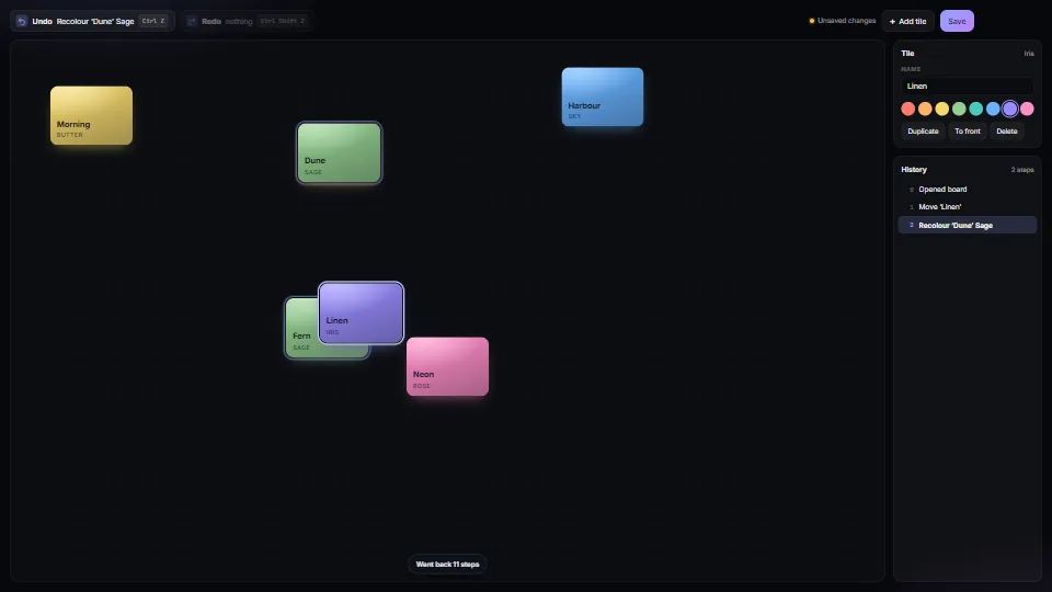
Undo that says what it undoes
An undo/redo history whose steps carry a few words, so the buttons say “Undo Move ‘Dune’”; one drag or one typing session is one step, and so is a drag of a…